Appearance
eWizard.js framework v4.5.1
New framework features and updates
Introduced the
v-switchdirective that allows for displaying and hiding elements when a user interacts with the bound element.In the following code snippet, the
v-switchdirective is used to show thetextToShow1,textToShow2text components and hide thetextToHideelement upon the click on thewiz-button.Note
Initially,
v-switchshows all elements defined in thehideproperty and hides those stated in theshowproperty:
html
<i18n>
  {
    "eng": {
      "show1": "Hello, Amigo!",
      "show2": "This text was initially hidden!",
      "hide": "This text is initially visible, but it will be hidden after click on the button"
    }
  }
</i18n>

<template>
  <wiz-slide>
    <wiz-text id="textToShow1" :text="$t('show1')"></wiz-text>
    <wiz-text id="textToShow2" :text="$t('show2')"></wiz-text>
    <wiz-text id="textToHide" :text="$t('hide')"></wiz-text>
    <wiz-button v-switch:click="{ show: ['textToShow1','textToShow2'], hide: 'textToHide'}" ></wiz-button>
  </wiz-slide>
</template>Introduced the
v-toggledirective that provides a possibility to toggle visibility of the DOM element or list of elements when a specified event occurs.In the below example, the
v-toggledirective toggles the visibility of thewiz-textcomponent with thetoToggleid each time when a user clicks onwiz-button.
html
<i18n>
  {
    "eng": {
      "toggle": "Some text that must be toggled"
    }
  }
</i18n>

<template>
  <wiz-slide>
    <wiz-text id="toToggle" :text="$t('toggle')"></wiz-text>
    <wiz-button v-toggle:click="'toToggle'"></wiz-button>
  </wiz-slide>
</template>- Added ability to add a placeholder to the website or email brief in eWizard UP:
Root component for emails
At the current update we released a new root container for emails, wiz-root.
Instead of using the table > tr > td, div, wiz-block tag series, the wiz-root tag can be used.
It helps to clean the code and get a new entry point for the builder and editor.
Also, changing the wiz-root id attribute causes the e-Detailer/email browser display breakage, so this change is prohibited.
eWizard-cli 0.8.1
Scaffolding for sites and briefs
Now it is possible to init and work with microsites and briefs in eWizard CLI. To facilitate this possibility, eWizard CLI commands are enhanced with new options:
wiz initfor brief email and sitewiz initfor sitewiz installfor components into site and briefswiz devfor site and briefs
The detailed information can be found here.
e-Detailer builder enhancements
The list of supported builds is updated. Currently, you can build e-Detailers for different CLMs with the following commands: iqvia-spa, viseven-spa, irep-spa, irep-mpa, oce-spa, oce-mpa, rainmaker-spa.
Also, the prod command is renamed to spa. Hence, to make a spa build of your e-Detailer use the spa command.
Besides the --sequenceType=single parameter is added to the oce-mpa build.
PDF exporting service plugin
A new plugin for PDF Export Service is added. It is used to export e-Detailers to PDF Document with slide states.
To screenshot a slide with a several-states component keeping all components printed in an output PDF (for example, with a popup opened and closed), apply the components activation.
To produce a state, the component instance must feature the activate method. This method must change the component's props or data and define the logic of how to display a component after the activation.
Example:
HTML
<template>
  <div class="example-component">
    <p>The image bellow will be visible on the second screenshot</p>
    <wiz-image v-if="isVisible"></wiz-image>
  </div>
</template>

<script>
import wizImage from "wiz-image"
export default {
  name: "example-component",
  components: {
    wizImage
  },
  data() {
    return {
      isVisible: false
    };
  },
  methods: {
    activate() {
      this.isVisible = true;
    },
    deactivate() {
      this.isVisible = true;
    }
  },
};
</script>
While exporting an e-Detailer with example-component on a slide, the two states of this slide are available in the PDF. The first one with our predefined text and the second one with wiz-image visible. Refer to our new article PDF exporting service plugin for details.
To generate slide states for e-Detailers export to PDF, we added the activate and deactivate methods to the interactive components below:
- wiz-tab-group
- wiz-popup
- wiz-flip
- wiz-carousel
- wiz-coverflow
- wiz-accordion
AEM skins
AEM skins is the feature that provides possibilities for stylization the AEM components.
To use the AEM skins:
- Install them as a node_module with the following command:
bash
wiz i git+ssh://git@git.qapint.com:path/to/skin/source/skin.git- Link the node_module to the
App.vuefile with the import command:
js
@import 'node_modules/skin';- Add the
isellingobject into theclmsobject in thesetting.jsonfile:
json
{
"clms": {
"iselling":{
"skinName": "saxenda-skin",
"presentationSkin": "/etc/designs/iselling/skins/path/to/skin",
"presentationSkinVersion": "WORKING_COPY"
}
}
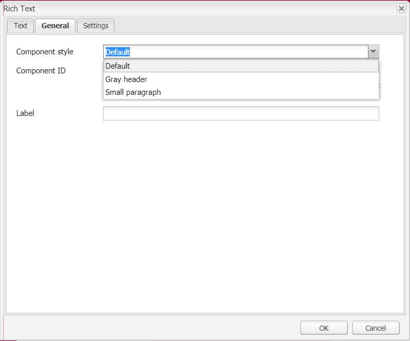
}On top of that, we have developed an awesome feature to get styles from a skin in the eWizard editor drop-down list. To use it, specify the CSS classes in the componetStyle.json file.
json
{
  "container": [
    {
      "style": "gray-header",
      "title": "Gray header"
    },
    {
      "style": "small-paragraph",
      "title": "Small paragraph"
    }
  ],
  "tabContainer": [
    {
      "style": "tab-efficacy",
      "title": "Efficacy tab group"
    },
    {
      "style": "tab-glycaemicControl",
      "title": "GlycaemicControl tab group"
    }
  ]
}
AEM converter components implementation
The goto buttons: goto.prev, goto.next functionality is improved.
Now, the AEM build supports video components and different fonts.
At this update the AEM converter supports a number of new components:
- wiz-references
- wiz-tab-group
- wiz-video
- wiz-checkbox-group
- wiz-increment-slider
- wiz-button
- wiz-popup
- wiz-image
- wiz-text
- wiz-radio-group
- wiz-drop-down-list
- wiz-text-area
- wiz-input
And even more improvements are implemented, including parser speed optimization and others.
Subslides
The subslides are introduced to e-Detailers! Subslides are supplemental slides that complement the main slide to reveal its key message. The key point of a subslide is its configurable swipe direction for navigation between the subslides within the main slide.
For example, when your e-Detailer includes the subslides with some additional information that does not go with the main flow and, therefore, can be skipped to any extent, you can set up horizontal navigation between the e-Detailer's slides, and vertical - between the subslides.
Currently, subslides are supported only in the spa-based builds, the oce-mpa build, and the AEM build.
Find below the e-Detailer sample structure with subslides:
json
"slides": {
   "vanilaCookie": {
       "name": "Vanilla Cookies",
       "template": "slides/vanilaCookie/index.vue",
       "subslides": [
           "cookiePhoto",
           "cookieRecipe"
       ]
   },
   "cookiePhoto": {
       "name": "cookieRecipe",
       "template": "slides/cookiePhoto/index.vue"
   },
   "cookieRecipe": {
       "name": "cookieRecipe",
       "template": "slides/cookieRecipe/index.vue"
   },
   "chocolateCookie": {
       "name": "Chocolate Cookies",
       "template": "slides/chocolateCookie/index.vue"
   },
   "biscuit": {
       "name": "Chocolate Cookies",
       "template": "slides/biscuit/index.vue"
   }
}
We have updated the e-Detailers' navigation settings so that you can configure the swipe between subslides at your discretion. When the subslides' swipe settings are missing in the navigation object, the default settings are applied:
json
"navigation": {
  "swipe":
  ...
    "subslide":{
      "direction": "vertical",
      "touchesCount": 1,
      "enabled": true
    }
}
The e-Detailers' Navigator module is updated to support subslides. The Navigator methods that are supplemented with the additional subslides navigation options are as follows:
goToNextSlide(force, { subslide: true })goToPrevSlide(force, { subslide: true })
Refer to Navigation plugin to learn the documentation updates.
Sublsides creation
A new command wiz subslide is implemented. It creates a subslide with the specified subslideId and adds it to the existing slide with the specified slideId.
Syntax
wiz subslide <subslideId> --slide|s <slideId>
Bugfixes and small enhancements
The expanded block functionality
Now, the default email templates contain non-expanded blocks. It streamlines the email master template development and makes possible the developed blocks reuse. You can develop a block once and then link it to any email instead of copying and pasting it to every email one-be-one. On top of that, it allows for fixing several issues at once: just reinstall the block in the required emails - and the issue is fixed everywhere.
Fixed issue with unsupported styles
Previously, when uploading a PDF with components that contain perspective, the PDF layers were ordered in the same way as in the original HTML. It caused incorrectness in some interactive components display of the exported e-Detailer.
Now, this behavior is fixed with the z-index property added to the three below components:
- Cowerflow
- Flip
- Carousel