Appearance
e-Detailer tutorial
This tutorial guides you through building an e-Detailer with images, eWizard components, and animation within slides. By the end, you'll have a functional e-Detailer ready for deployment. You can use HTML, CSS, and eWizard components to add:
- Slides
- Content
- Animation
- Styles
For this, you need to have the eWizard CLI installed locally.
Create e-Detailer project
To create an e-Detailer, run:
shell
wiz init edetailer my-edetailerwhere:
edetailerrefers to the e-Detailer content item typemy-edetaileris the project name
eWizard CLI adds the e-Detailer project with a scaffolding template and a directory structure. To edit a slide, open the slides directory in a file explorer or an IDE. Each slide is stored in a subdirectory within the slides directory. Here is an example of an e-Detailer directory with five slides: default, slide, slide2, slide3, and slide4:
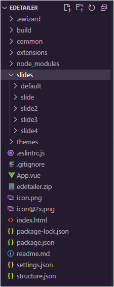
For more information, see e-Detailer directory structure.
Each slide has a media subdirectory that contains all media used in a slide: fonts, images, PDF files, and videos.
You can add markup, components, style, and logic in the index.vue file of each slide subdirectory.
The default index.vue file has the following structure:
html
<i18n>
  {
    "eng": {
      "text": "Welcome to the slide!"
    }
  }
</i18n>

<template>
  <wiz-slide>
    <wiz-text :text="$t('text')"></wiz-text>
  </wiz-slide>
</template>
<script>
export default {};
</script>
<style scoped></style>
Use the <template> tag to set the list of components for the slide. You can use various components, such as text, images, buttons, and sliders. For more information about e-Detailer components, see e-Detailer components list.
There can be only one <template> tag in a file and it can't be removed. You can put components only in the <template> tag.
Run development build
You can run a development build locally to preview your slide before archiving.
To run a live development build:
Go to your e-Detailer directory.
Run:
wiz dev --liveThis starts the local server at http://localhost:3000/, which is hot-reloaded to reflect any changes you make to your project.
Read more about wiz dev options.The
builddirectory is created in your project.
Read more about e-Detailer directory structure.
Add components
Use eWizard.js components to add content to your e-Detailer.
Text
You can add text to a slide with the wiz-text component. For more information about the component, see wiz-text.
To add text to a slide:
Navigate to the slide you want to modify in the
slidesdirectory.
For example, if you want to edit slide 1, go toslides/slide1/.Add the
wiz-textcomponent within the<template>in theindex.vuefile.html<!-- ./slides/slide1/index.vue --> <i18n> { "eng": { "text": "Welcome to the slide!" } } </i18n> <template> <wiz-slide> <wiz-text :text="$t('text')"></wiz-text> </wiz-slide> </template> <script> export default {}; </script> <style scoped></style>Modify the value of the
textvariable within the<i18n>tag. For example, enterMy first slideas the text that is displayed on the slide:html<!-- ../index.vue --> <i18n> { "eng": { "text": "My first slide" } } </i18n>
Image
To add an image to the slide:
Navigate to the slide you want to modify in the
slidesdirectory.
For example, if you want to edit slide 1, go toslides/slide1/.Add the
wiz-imagecomponent within the<template>in theindex.vuefile.html<!-- ../index.vue --> <i18n> { "eng": { "title": "<span style='line-height:30px;font-size:30px;'>An image</span>" } } </i18n> <template> <wiz-slide> <wiz-text :text="$t('title')" id="title"></wiz-text> <div class="image-layout"> <wiz-image :src="defaultImage" class="slide-image"></wiz-image> </div> </wiz-slide> </template> <script> import defaultImage from './media/images/default-image2.png'; export default { data() { return { defaultImage, }; }, }; </script> <style scoped></style>
The defaultImage variable defines the image you use in the slide. Specify the image source for the defaultImage with the import variable.
Also, you can enter the path to the image in the src attribute. For example:
html
<wiz-image src="./media/images/default-image2.png" class="slide-image"></wiz-image>For more information, see wiz-image.
If you want to use an image only in one slide, place it in the ./slides/SLIDE_NAME/media/images/ directory. To reuse an image in several slides, place the image in the common/media/images directory.
Video
When you add video files to your e-Detailer in eWizard Editor, eWizard.js stores them in the following directories of the project directory:
./common/media/videos/if you upload a video file to the e-Detailer in the Master template mode. Also, this directory stores video files for the e-Detailers converted from PPTX presentations../slides/slide_001/media/videos/if you add a video file to a specific slide of the e-Detailer.
In certain cases, the video files that you delete in eWizard Editor remain in the ./slides/ or ./common/media/videos/ project directories. You can notice this issue by the zipped archive size. To reduce the archive size, remove the unnecessary video files from the required project directory manually.
All video files you add in eWizard Editor receive new names when stored in the project directory. For example, add the My video.mp4 video file to the video component in eWizard Editor. Open the project directory locally, the video filename changes to the following:
./slides/slide_001/media/videos/682d1750-38be-11ec-a033-2ab36596d197.mp4
To ensure your video files have meaningful names:
Change the video filename in the actual video file location.
./slides/slide_001/media/videos/my-video.mp4Change the
srcpath to the video file in the slideindex.vuefile.js// ./slides/slide_001/index.vue <template> <wiz-slide class="editable-block"> <wiz-video id="wiz-video-c49a" class="default" src="./media/videos/my-video.mp4" data-asset-id="7p2eahdwm1"></wiz-video> </wiz-slide> </template>Build and zip the project.
shwiz archiveUpload the zipped project to the eWizard platform.
When you change the video filenames locally and upload your project to the eWizard platform, eWizard Editor doesn't change the video filenames.
Edit master template
By default, you can edit each e-Detailer slide separately in eWizard Editor. The changes are saved in the index.vue file of each slide directory. In Master template mode, you can edit all slides of an e-Detailer at the same time. Changes in Master template mode are applied to all slides at the same time and saved in the App.vue file.
You can add localization to the App.vue file. For more information, see Localization of master template.
To edit a master template:
Upload your e-Detailer to the eWizard platform and open it in eWizard Editor.
Activate the Master template mode.
Add components and blocks in eWizard Editor. For more information about component installation see Import and register components.
As best practice, use eWizard Editor to add and edit the components.
Blocks and components added in Master template mode are displayed in the <wiz-root> tag of the App.vue file.
For example, <wiz-text>, <wiz-image> components, and the module-placeholder block:
The id and class attribute is required for the correct display of styles in eWizard Editor.
html
<!-- ./App.vue -->

<i18n>
{
  "eng": {
    "wiz_text_c66d": "<p style=\"text-align:center;\">Text</p>",
  }
}
</i18n>

<template>
<wiz-root class="editable-block">
  <wiz-viewer>
    <header></header>
    <footer></footer>
  </wiz-viewer>
  <wiz-text id="wiz-text-59fe" class="default" :text="$t('wiz_text_c66d')"></wiz-text>
  <wiz-image id="wiz-image-22fe" class="default" src="./common/media/images/f6194d90-8f03-11ec-96c2-ea6c057b1b2f.jpg"></wiz-image>
  <wiz-block class="module-placeholder" data-block-id="module-placeholder" id="wiz-block-f7ff"></wiz-block>
</wiz-root>
</template>

<script>
export default {
  components: {},
  name: 'wiz-app',
  data() {
    return {};
  },
};
</script>

<style scoped>
    @import 'common/styles/imports.css';
    body {
        padding: 0;
        margin: 0;
    }
    .root {
        background-color: #fff;
    }
</style>

<style scoped editor>
#wiz-text-59fe {
  position: absolute;
  top: 0px;
  left: 0px;
  z-index: 1;
  -webkit-transform: matrix(1, 0, 0, 1, 119.778, 126.389);
  -ms-transform: matrix(1, 0, 0, 1, 119.778, 126.389);
  transform: matrix(1, 0, 0, 1, 119.778, 126.389);
  height: auto;
}
#wiz-image-22fe {
  position: absolute;
  top: 0px;
  left: 0px;
  z-index: 2;
  -webkit-transform: matrix(1, 0, 0, 1, 267.56, 230.67);
  -ms-transform: matrix(1, 0, 0, 1, 267.56, 230.67);
  transform: matrix(1, 0, 0, 1, 267.56, 230.67);
  width: 320px;
  height: 213px;
}
#wiz-text-3417 {
  position: absolute;
  top: 0px;
  left: 0px;
  z-index: 3;
  -webkit-transform: matrix(1, 0, 0, 1, 269.778, 549.722);
  -ms-transform: matrix(1, 0, 0, 1, 269.778, 549.722);
  transform: matrix(1, 0, 0, 1, 269.778, 549.722);
  height: auto;
}
#wiz-block-f7ff {
  z-index: 4;
}
</style>
Change structure
Each e-Detailer has a specific structure that's defined in the structure.json file of an e-Detailer directory.
The e-Detailer structure is defined in the structure.json file of an e-Detailer directory.
For more information, see e-Detailer structure.
This is an example of a structure.json file for an e-Detailer with four slides: default, slide2, slide3, slide4.
json
// ./structure.json

{
  "slides": {
    "default": {
      "name": "Template Slide",
      "template": "slides/default/index.vue"
    },
    "slide2": {
      "name": "slide2",
      "template": "slides/slide2/index.vue"
    },
    "slide3": {
      "name": "slide3",
      "template": "slides/slide3/index.vue"
    },
    "slide": {
      "name": "slide",
      "template": "slides/slide/index.vue"
    },
    "slide4": {
      "name": "slide4",
      "template": "slides/slide4/index.vue"
    }
  },
  "chapters": {
    "main": {
      "name": "Template Chapter",
      "content": [
        "default",
      ]
    }
  },
  "storyboard": [
    "main"
  ],
  "start": {}
}
Add new slide
A slide is a an e-Detailer page that separates it's content. A slide can consist of several subslides. Slides are grouped into chapters. The chapters are defined in storyboards, so that they are displayed in an e-Detailer.
To add a new slide, run:
sh
wiz slide [SLIDE_ID]A new slide directory is created in the ./slides/ directory. The slide ID is the same as the directory name. For example, default is both the slide ID and the directory name.
For more information about the wiz slide command, see wiz slide options.
Every slide ID is displayed in the structure.json file. For example:
json
// ./structure.json

{
  "slides": {
    "default": {
      "name": "Template Slide",
      "template": "slides/default/index.vue"
    },
  }
}
Each slide has the following fields:
nameis the name of the slide in eWizard Editor.templateis a reference to the Vue component associated with the slide.
For more information, see Slides.
Add subslides
You can use subslides to add more info on the same slide.
To add subslides:
Open the
structure.jsonfile of your e-Detailer directory.Set the subslides in the
subslidesarray. Here is adefaultslide with two subslides:slide3andslide4:json// ./structure.json "slides": { "default": { "name": "Template Slide", "template": "slides/default/index.vue", "subslides": [ "slide3", "slide4" ] }
For more information, see Subslides.
Add chapter
Group your slides into chapters to add more structure to the content within the e-Detailer.
To add a slide to a chapter:
Open the
structure.jsonfile of your e-Detailer directory.Set the chapters in the
chapterobject. The following example has two chapters,templateandmain:json// ./structure.json "chapters": { "template": { "name": "Template Chapter", "content": [ "default", "slide2" ] }, "main": { "name": "Template Chapter", "content": [ "slide3", "slide4" ] } },Enter the slide IDs for each chapter in the
contentarray.
The slides are demonstrated in the display order defined within each chapter. In this example, the slide2 slide is displayed after the default slide in the template chapter.
For more information, see Chapters.
Add storyboard
To switch between the e-Detailer chapters, add them to the storyboard array.
eWizard.js treats chapters outside of storyboards as hidden. You can access hidden chapters only through the address bar.
To add a chapter to the storyboard:
Open the
structure.jsonfile of your e-Detailer directory.Set the chapters in the
storyboardarray. There are two chapters in the following storyboard:templateandmain.json// ./structure.json "storyboard": [ "template", "main" ],
The storyboard array defines the display order of the chapters. In this example, the main chapter is displayed after the template chapter.
For more information, see Storyboard.
Set opening slide
Use the start object to set the first demonstrated slide and chapter of your e-Detailer.
To use the start object:
Open the
structure.jsonfile of your e-Detailer directory.Set the starting slide and chapter. In the following
startobject, thedefaultslide from themainchapter is demonstrated first in the e-Detailer:json// ./structure.json "start": { "slide": "default", "chapter": "main" }
For more information, see Start.
Style
Read about breaking changes in new Sass versions.
Use CSS to update the look of your e-Detailer. You can change the style of a particular slide in the index.vue file, or you can apply a global style to the whole e-Detailer in the common/styles/main.css file.
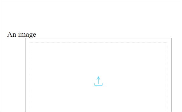
For example, an index.vue file with text and an image:
html
<!-- ./slides/default/index.vue -->

<i18n>
{
  "eng": {
    "title": "<span style='line-height:30px;font-size:30px;'>An image</span>"
  }
}
</i18n>

<template>
  <wiz-slide>
    <wiz-text :text="$t('title')" id="title"></wiz-text>
    <div class="image-layout">
      <wiz-image :src="defaultImage" class="slide-image"></wiz-image>
    </div>
  </wiz-slide>
</template>

<script>
import defaultImage from './media/images/default-image2.png';

export default {
  data() {
    return {
      defaultImage,
    };
  },
};
</script>
<style scoped>

</style>

<style scoped editor>
</style>
Here's how the slide looks in a browser:
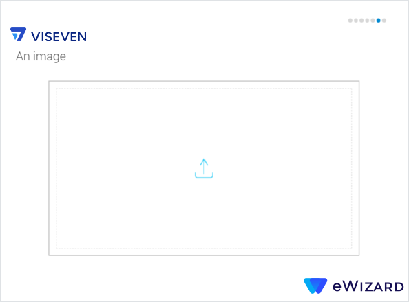
To add CSS styles to the slide:
Open the slide you want to edit:
./slides/default/index.vue, wheredefaultis the name of your slide.Add the appropriate CSS styles within the
<style>tag. For example:
html
<!-- ./slides/default/index.vue -->

<i18n>
{
  "eng": {
    "title": "An image"
  }
}
</i18n>

<template>
  <wiz-slide>
    <wiz-text :text="$t('title')" id="title"></wiz-text>
    <div class="image-layout">
      <wiz-image :src="defaultImage" class="slide-image"></wiz-image>
    </div>
  </wiz-slide>
</template>

<script>
  import defaultImage from "./media/images/default-image2.png";

  export default {
    data() {
      return {
        defaultImage,
      };
    },
  };
</script>
<style scoped>
  .wiz-slide {
    padding: 125px 1.8em 80px;
  }
  .image-layout {
    width: 80%;
    margin: auto;
    padding: 17px;
    height: 77.4%;
    box-sizing: border-box;
    border: 1px solid #a0a0a0;
  }
  .wiz-slide ::v-deep( .slide-image.wiz-image) {
    display: flex;
    justify-content: center;
    align-items: center;
    align-self: center;
    width: 100%;
    height: 100%;
    padding: 15px;
    box-sizing: border-box;
    border: 1.5px dashed rgba(112, 112, 112, 0.27);
  }
  .wiz-slide ::v-deep( .slide-image.wiz-image img) {
    box-sizing: border-box;
  }
</style>

<style scoped editor></style>
To add or edit the styles globally on all the slides of the e-Detailer, edit the ./common/styles/main.css file. For example:
css
* {
  -webkit-touch-callout: none;
  -webkit-user-select: none;
  -moz-user-select: none;
  -ms-user-select: none;
  user-select: none;
  -webkit-tap-highlight-color: transparent;
  box-sizing: border-box;
}
/*-----Common elements-----*/
body {
  background: #000;
}
body > .root {
  width: 1024px !important;
  height: 768px !important;
  margin: 0 auto;
}
.blank header,
.blank footer {
  height: 0;
  opacity: 0;
  visibility: hidden;
}
.blank #viewer,
.blank .wiz-slide,
.blank .child-view {
  height: 100%;
}
#viewer {
  background: #fff;
}
#app,
.root {
  height: 100%;
}
.root {
  display: flex;
  flex-direction: column;
}
.blank .wiz-slide.blank-template {
  height: 100%;
  margin-top: 0;
}
.wiz-slide {
  display: flex;
  flex-direction: column;
  height: 100%;
  min-width: 1024px;
  box-sizing: border-box;
}
#title {
  margin-left: 15px;
  font: normal 30px RobotoLight;
  color: #383838;
}
/*-----Header-----*/
#viewer > header {
  position: absolute;
  top: 0;
  left: 0;
  display: flex;
  width: 100%;
  height: 115px;
}
#visevenLogo {
  align-self: center;
  width: 145px;
  height: 60px;
  margin: 45px auto 0 1.8em;
  background: transparent;
}
#indicator {
  position: relative;
  display: flex;
  width: 20%;
}
#indicator .indicators-container {
  display: flex;
  align-self: center;
  margin: auto 55px;
  padding: 0;
}
/*-----Footer-----*/
#viewer > footer {
  position: absolute;
  bottom: 0;
  left: 0;
  display: flex;
  flex-direction: column-reverse;
  align-items: flex-end;
  width: 100%;
  height: 77px;
  border-bottom: 4px solid #0089d0;
  text-align: end;
}
#ewizardLogo {
  position: relative;
  width: 150px;
  height: 37px;
  z-index: 2;
  margin: 0 50px 30px;
  background: transparent;
}
#ewizardLogo.pressed {
  background: transparent;
}
#ewizardLogo .wiz-image {
  width: 100%;
  height: 100%;
}
#sitemap .wiz-sitemap-item.wiz-button {
  height: 127px;
  background: none;
}
#sitemap .wiz-sitemap-item.active,
#sitemap .wiz-sitemap-chapter.active {
  border: none;
  overflow: visible;
}
#sitemap .wiz-sitemap-chapter > .wiz-text {
  text-align: center;
}
#chapterMenu {
  position: absolute;
  height: 50px;
  z-index: 5;
}
#chapterMenu .move-wrapper {
  background: #29b6f6;
}
#chapterMenu .chapter-button {
  width: 242px;
  transform: translate3d(0, 0, 0);
}
#chapterMenu .chapter-button:first-child {
  width: 60px;
}
#chapterMenu .chapter-button:last-of-type {
  border-right: 2px solid #55cff4;
}
#chapterMenu.wiz-chapter-menu .chapter-button.active {
  padding-top: 0;
  border-top: 4px solid #fff;
  background: #0288d1;
}
#chapterMenu .chapter-button .wiz-text {
  text-align: center;
}
@media(max-width:1024px) {
  .child-view .wiz-slide,
  #chapterMenu {
    max-width: 1024px;
  }
}
body {
  width: 100%;
  height: 100%;
}
p,
h1,
h2,
h3,
h4,
h5,
h6 {
  margin: 0;
  padding: 0;
}
ul,
ol {
  margin: 0;
}
.root {
  font-family: Arial, Helvetica, sans-serif;
  text-align: left;
}
.round-slider-wrapper {
  display: flex;
  align-items: center;
  justify-content: center;
}
.round-slider-wrapper .wiz-container.counter {
  display: flex;
  justify-content: center;
  align-items: center;
  width: 260px;
  height: 260px;
  border-radius: 50%;
  background: #e6e6e6;
  pointer-events: auto;
}
.round-slider-wrapper .counter .wiz-text {
  font: 96px/1.2 RobotoCondensed;
  color: #0288d1;
}
The edited slide looks like this:
Build
After you finish developing your e-Detailer, you can make a ZIP archive of your project and upload it to the eWizard platform.
To create an archive with a specific name, run:
sh
wiz archive --name [ARCHIVE_NAME]For example, when you run wiz archive --name edetailer you create an archive named edetailer.
The wiz archive command has several options. For more information, see wiz archive [options].