Appearance
wiz-references
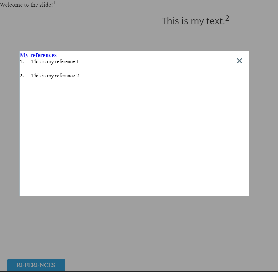
The wiz-references compound component includes two others: wiz-references-button and wiz-references-popup. The references component is a button on the slide that triggers the pop-up with references. The references pop-up is an HTML table with the list of references—citations of the sources used in your e-Detailer. Each reference has its ID. Use eWizard Editor to add references to the e-Detailer template. For more information about using references in eWizard Editor, see References.
For more information about working with references locally in your project, see References.
Learn more about components
Usage
To use the wiz-references component on your e-Detailer template:
Add the
<wiz-references></wiz-references>tag to your e-Detailer template in the slideindex.vuefile, for example,slides/default/index.vue.html<!--./slides/default/index.vue --> <template> <wiz-slide class="editable-block"> <wiz-references></wiz-references> </wiz-slide> </template>If you want to show the references button and pop-up on all slides, add the
wiz-referencescomponent to the template in the./App.vuefile of your e-Detailer. In this case, you don't need to add thewiz-referencescomponent to the template in the Vue file for each slide.Use the Master template mode in eWizard Editor to view the references, button, and pop-up components on the Tree tab. You can edit the properties of these three components on the Properties tab.
Add the
<wiz-references-button></wiz-references-button>and<wiz-references-popup></wiz-references-popup>tags inside the<wiz-references></wiz-references>tag.html<!--./slides/default/index.vue --> <wiz-references> <wiz-references-button v-open.popup="'refPopup'"></wiz-references-button> <wiz-references-popup id="refPopup"></wiz-references-popup> </wiz-references>The
wiz-references-buttoncomponent has thev-opendirective that triggers the Open pop-up action.Add the attributes to the respective components tags.
html<!--./slides/default/index.vue --> <template> <wiz-slide class="editable-block"> <wiz-references component-name="My references" type="edetailer-notes" separator="brackets" range-delimiter="—" :merge-numbers="false" number-format="asterisk" visibility="allSlides"> <wiz-references-button v-open.popup="'refPopup'" :text="$t('wiz_references_button_ba51')" data-asset-id="svbkpuikvj" image-src="./media/images/e95272c0-0bba-11ec-8a48-06c02543afe7.png" ></wiz-references-button> <wiz-references-popup id="refPopup" component-name="My references pop-up" :name="$t('wiz_references_popup_662f')" :open-by-tap-refs="true" data-asset-id="ed5pu8wpg0" close-button-icon="./media/images/37022210-5d7b-11ec-b91a-85800ef85ec4.png" close-button-position="rightBottom" :show-overlay="true" :close-on-outside-tap="true" :show-close-button="true" ></wiz-references-popup> </wiz-references> </wiz-slide> </template>The
data-asset-idattribute is required for the Veeva Vault modules in theassets.jsonfile. For more information, see Veeva Vault publish settings.Change the references button and pop-up text in the
<i18n></i18n>localization tag.json// ./slides/default/index.vue <i18n> { "eng": { "wiz_references_button_ba51": "<p>My references</p>", "wiz_references_popup_662f": "<p><span style=\"color:#1115e7ff;\"><b>My references</b></span></p>" } } </i18n>For more information, see Localization.
Attributes
To change the wiz-references component appearance and behavior, you need to change the attributes for the wiz-references-button and wiz-references-popup components that are inside the wiz-references component.
wiz-references
The wiz-references component has the following attributes:
component-nameChange the component name that appears on the eWizard Editor Properties tab.
html<wiz-references component-name="My references"></wiz-references>typeChange the reference numbering order:
Use the
slide-notestype to show the reference number relative to the references on a slide.Use the
edetailer-notestype to show the reference number relative to the list of all references in the e-Detailer.html<wiz-references type="edetailer-notes"></wiz-references>
separatorChange the separator between the reference numbers:
commaorbrackets. For example:1,2,3or[1][2][3].html<wiz-references separator="brackets"></wiz-references>range-delimiterChange the range separation symbol between the reference numbers: hyphen
‐, en-dash–, or em-dash—. For example,1—3for the en-dash delimiter.html<wiz-references range-delimiter="—"></wiz-references>merge-numbersSelect
trueto add a range delimiter for consecutive numbers, for example1–3. Selectfalseto separate all numbers with commas, for example:1,2,3. In case of brackets, no commas are used:[1][2][3].html<wiz-references :merge-numbers="false"></wiz-references>number-formatSelect the reference symbol format:
decimalfor numbers:1,2,3.upper-alphafor uppercase letters:A,B,C.lower-alphafor lowercase letters:a,b,c.asteriskfor*,**,***.html<wiz-references number-format="asterisk"></wiz-references>
visibilitySelect the
allSlidesto show the references button on all slides. SelectslideReferencesto show the references button only on the slides with the references.html<wiz-references visibility="allSlides"></wiz-references>
wiz-references-button
The wiz-references-button component has the v-open directive that triggers the Open pop-up action.
html
<!--./slides/default/index.vue -->

<wiz-references>
    <wiz-references-button v-open.popup="'refPopup'"></wiz-references-button>
</wiz-references>
The wiz-references-popup component uses the 'refPopup' string value from the wiz-references-button component as an ID to open the pop-up.
The wiz-references-button component has the following attributes:
textChange the references button text.
html<wiz-references> <wiz-references-button :text="$t('wiz_references_button_ba51')"></wiz-references-button> </wiz-references>font-colorChange the references button color. Use the Hex or RGBA color code.
html<wiz-references> <wiz-references-button font-color="#eaf1f180"></wiz-references-button> </wiz-references>image-srcChange the references button background image. Add the path to the image file. By default, eWizard Editor stores the image in the slide
media/imagesdirectory.html<wiz-references> <wiz-references-button image-src="./media/images/e95272c0-0bba-11ec-8a48-06c02543afe7.png"></wiz-references-button> </wiz-references>
wiz-references-popup
The wiz-references-popup component provides the id attribute with the 'refPopup' value for the v-open directive in the wiz-references-button component.
The wiz-references-popup component has the following attributes:
component-nameChange the component name on the eWizard Editor Properties tab.
html<wiz-references> <wiz-references-popup component-name="My references pop-up"></wiz-references-popup> </wiz-references>nameChange the references pop-up header that appears above the list of references.
html<wiz-references> <wiz-references-popup :name="$t('wiz_references_popup_662f')"></wiz-references-popup> </wiz-references>open-by-tap-refsSelect
trueto open the references pop-up with a click or tap on the reference number on the slide.html<wiz-references> <wiz-references-popup :open-by-tap-refs="true"></wiz-references-popup> </wiz-references>close-button-iconAdd the path to the button icon image for closing the references pop-up.
html<wiz-references> <wiz-references-popup close-button-icon="./media/images/37022210-5d7b-11ec-b91a-85800ef85ec4.png"></wiz-references-popup> </wiz-references>close-button-positionSelect the position of the button icon for closing the references pop-up:
rightBottom,center, etc.html<wiz-references> <wiz-references-popup close-button-position="rightBottom"></wiz-references-popup> </wiz-references>show-overlaySelect
trueto show the gray background for the slide area outside of the references pop-up.html<wiz-references> <wiz-references-popup :show-overlay="false"></wiz-references-popup> </wiz-references>close-on-outside-tapSelect
trueto close the references pop-up when you click or tap the slide area outside of the references pop-up.html<wiz-references> <wiz-references-popup :close-on-outside-tap="false"></wiz-references-popup> </wiz-references>show-close-buttonSelect
trueorfalseto show or hide the close button icon on the references pop-up.html<wiz-references> <wiz-references-popup :show-close-button="true"></wiz-references-popup> </wiz-references>
Properties
wiz-references
The following properties are available:
| Property | Type | Default value | Description |
|---|---|---|---|
componentName | string | References | The text label displayed in eWizard Editor. |
mergeNumbers | boolean | true | A range delimiter for consecutive numbers, for example 1–3. Select false to separate all numbers with commas, for example: 1,2,3. In case of brackets, no commas are used: [1][2][3]. |
numberFormat | string | decimal | The reference symbol format: decimal, upper-alpha, lower-alpha, or asterisk. |
rangeDelimiter | string | hyphen (-) | The range separation symbol between the reference numbers: hyphen ‐, en-dash –, or em-dash —. For example: 1—3 for the en-dash delimiter. |
separator | string | comma | The separator between the reference numbers: comma or brackets. For example: 1,2,3 or [1][2][3]. |
type | string | slide-notes | The scope of context the references are assigned and displayed. One of: "edetailer-notes", "slide-notes". For slide-notes, the reference numbering starts anew on each next slide. For edetailer-notes, the reference numbering continues sequentially across all slides in the e-Detailer. |
visibility | string | slideReferences | 'allSlides' displays the References button on all slides. 'slideReferences' displays the References button only on the slides with the references. |
wiz-references-button
The following properties are available:
| Property | Type | Default value | Description |
|---|---|---|---|
fontColor | string | #ffffff | The References button color. Input: RGBA or 6- or 8-digit HEX. |
imageSrc | string | N/A | The path to the card image. |
text | string | REFERENCES | The editable text displayed on the content item layout in eWizard Editor. |
wiz-references-popup
The following properties are available:
| Property | Type | Default value | Description |
|---|---|---|---|
componentName | string | References popup | The text label displayed in eWizard Editor. |
displayRefsIdList | array | [] | Displays the list of reference IDs. |
header | string | References | Component header text. |
name | string | References | The references pop-up header that appears above the list of references. |
openByTapRefs | boolean | false | Opens the references pop-up when clicking or tapping on the reference number in the slide. |
scrollerBarOpts | object | background: "rgba(99, 189, 234, 1)" | The background color for the scroll bar. |
scrollerScrollPanelOpts | object | scrollingX: false, scrollingY: true | Scrolls the references list horizontally (X) and vertically (Y). |
scrollerRailOpts | object | background: "rgba(99, 99, 99, 0.13)" | The scroll rail background color. |