Appearance
wiz-card-carousel
With the wiz-card-carousel component, you can create a carousel with pre-made cards that rotate vertically or horizontally.
Learn more about components
To add the wiz-card-carousel component to your slide and change its properties, in the ./slides/default/index.vue file:
Add the
<wiz-card-carousel></wiz-card-carousel>tag to your slide template.html<!--./slides/default/index.vue --> <template> <wiz-slide class="editable-block"> <wiz-card-carousel id="wiz-card-carousel-4c34" class="default" :items="[ { '__label':'Card 1', 'isHeaderVisible':true, 'header':$t('wiz_card_carousel_items_header_29d6'), 'headerColor':'#0288d1', 'isImageVisible':true, 'image':'node_modules/wiz-card-carousel/media/images/image.png', 'isParagraphVisible':true, 'paragraph':$t('wiz_card_carousel_items_paragraph_a7b0'), 'paragraphColor':'#ffffff','__id':'7-items-0' }, { '__label':'Card 2', 'isHeaderVisible':true, 'header':$t('wiz_card_carousel_items_header_69bc'), 'headerColor':'#0288d1', 'isImageVisible':true, 'image':'node_modules/wiz-card-carousel/media/images/image.png', 'isParagraphVisible':true, 'paragraph':$t('wiz_card_carousel_items_paragraph_36bb'), 'paragraphColor':'#ffffff', '__id':'7-items-1' }, { '__label':'Card 3', 'isHeaderVisible':true, 'header':$t('wiz_card_carousel_items_header_1e84'), 'headerColor':'#0288d1', 'isImageVisible':true, 'image':'node_modules/wiz-card-carousel/media/images/image.png', 'isParagraphVisible':true, 'paragraph':$t('wiz_card_carousel_items_paragraph_e1cc'), 'paragraphColor':'#ffffff', '__id':'7-items-2' }, { '__label':'Card 4', 'isHeaderVisible':true, 'header':$t('wiz_card_carousel_items_header_cc90'), 'headerColor':'#0288d1', 'isImageVisible':true, 'image':'node_modules/wiz-card-carousel/media/images/image.png', 'isParagraphVisible':true, 'paragraph':$t('wiz_card_carousel_items_paragraph_5912'), 'paragraphColor':'#ffffff', '__id':'7-items-3' } ]" orientation="vertical" direction="clockwise" :shift="2" :sensitivity="4" :radius="180" :is-snap="true" :current-item="1" ></wiz-card-carousel> </wiz-slide> </template>The
idattribute is required for the correct display of the component styles in eWizard Editor.The
__idattribute is required for the correct display of the card styles in eWizard Editor.Add the card title and text to the
<i18n></i18n>localization tag.json// ./slides/default/index.vue <i18n> { "eng": { "wiz_card_carousel_items_header_29d6": "#1 Card Header", "wiz_card_carousel_items_paragraph_a7b0": "<b>Paragraph Title</b><br/><br/>Lorem ipsum dolor", "wiz_card_carousel_items_header_69bc": "#2 Card Header", "wiz_card_carousel_items_paragraph_36bb": "<b>Paragraph Title</b><br/><br/>Lorem ipsum dolor", "wiz_card_carousel_items_header_1e84": "#3 Card Header", "wiz_card_carousel_items_paragraph_e1cc": "<b>Paragraph Title</b><br/><br/>Lorem ipsum dolor", "wiz_card_carousel_items_header_cc90": "#4 Card Header", "wiz_card_carousel_items_paragraph_5912": "<b>Paragraph Title</b><br/><br/>Lorem ipsum dolor" } } </i18n>
Attributes
You can change the wiz-card-carousel component appearance and behavior using the following attributes within the <wiz-card-carousel></wiz-card-carousel> tag.
component-nameEdit the value to change the label displayed on the component Properties tab in eWizard Editor.
html<wiz-card-carousel component-name="Carousel"></wiz-card-carousel>itemsThe
itemsarray includes the list of cards represented by the{}objects. Each card is an object with properties. To change the properties of each card, edit its attributes.html<wiz-card-carousel id="wiz-card-carousel-4c34" class="default" :items="[ { '__label':'Card 1', 'isHeaderVisible':true, 'header':$t('wiz_card_carousel_items_header_29d6'), 'headerColor':'#0288d1', 'isImageVisible':true, 'image':'./media/images/f6194d90-8f03-11ec-96c2-ea6c057b1b2f.jpg', 'isParagraphVisible':true, 'paragraph':$t('wiz_card_carousel_items_paragraph_a7b0'), 'paragraphColor':'#ffffff', '__id':'7-items-0' } ]" ></wiz-card-carousel>The
itemsarray includes the card objects with the following attributes:__label—required for displaying the card label in eWizard Editor.isHeaderVisible—iftrue, the card header shows on the card.header—text of the card header.headerColor—color of the card header background.isImageVisible—iftrue, the image shows on the card.image—the path to the image.isParagraphVisible—iftrue, the text shows on the card.paragraph—the card text.paragraphColor—the background color of the card text.
orientationTo rotate the cards vertically, set the value to
vertical. To rotate the cards horizontally, set the value tohorizontal.html<wiz-card-carousel orientation="vertical"></wiz-card-carousel>directionTo control the card rotation directions, update the property values. Use
bothto rotate the cards in both directions. You can also rotate the cardsclockwiseorcounterclockwise.html<wiz-card-carousel direction="both"></wiz-card-carousel>current-itemTo display a specific card of the carousel as the starting one, enter the number of the card. The numbering of the cards starts with
0. For example, in a carousel with three cards, the first card is numbered as0, the second is1, and the third is2.html<wiz-card-carousel :current-item="0"></wiz-card-carousel>shiftTo control how far the
current-itemis shifted in the specifieddirection, enter the value of the angle in degrees. You can enter a positive or a negative number, for example,90or-25.html<wiz-card-carousel :shift="35"></wiz-card-carousel>sensitivityTo change the rotation speed, enter the speed multiplier. The
sensitivityvalue is multiplied by the amount of pixels you rotate. For example, if you rotate 100px at a time, and yoursensitivityis2, the carousel rotates by 200px.html<wiz-card-carousel :sensitivity="4"></wiz-card-carousel>radiusTo change the radius of the circle the cards rotate on, enter the number in pixels.
html<wiz-card-carousel :radius="50"></wiz-card-carousel>For example:
A carousel where the
radiusis25: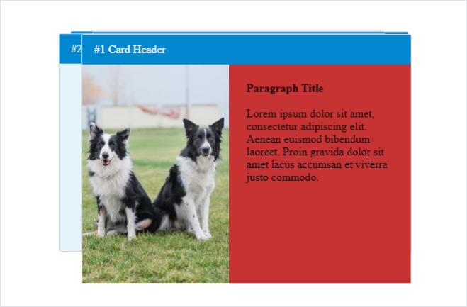
A carousel where the
radiusis90: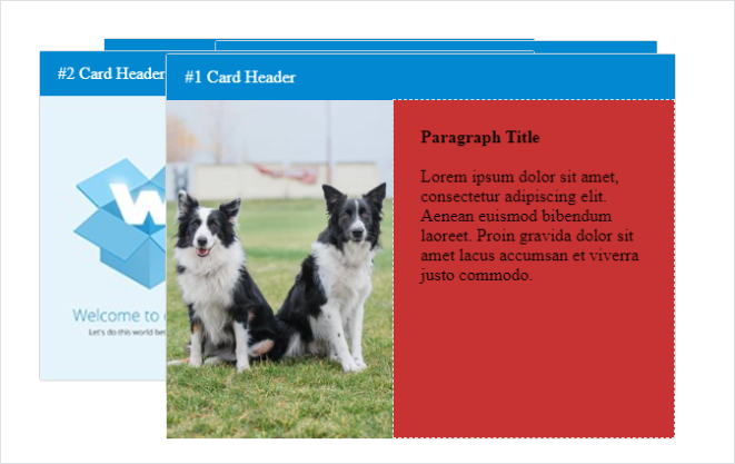
A carousel where the
radiusis360: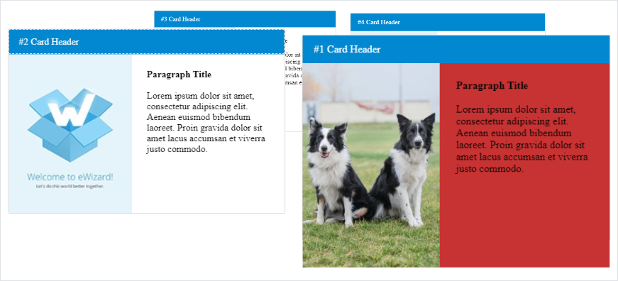
is-snapTo center the card you stop the rotation on, set the value to
true.html<wiz-card-carousel :is-snap="true"></wiz-card-carousel>
Properties
The following properties are available:
| Property | Type | Default value | Description |
|---|---|---|---|
blur | number | 0 | Carousel blur in pixels |
componentName | string | Carousel | The text label displayed in eWizard Editor. |
currentItem | number | 0 | Defines the starting card number of the carousel by default |
direction | string | both | Controls the card rotation direction. Rotate the cards `clockwise`, `counterclockwise`, or set `both` to rotate the cards in both directions. |
isSnap | boolean | true | If `true`, eWizard Editor centers the card you stop the rotation on. If `false`, the carousel stops on the exact place you leave it. |
items | array | [...] | Item settings. Includes the properties of each item. |
opacity | number | 100 | Carousel opacity in percent. |
orientation | string | horizontal | Controls whether the items rotate horizontally or vertically. |
perspective | number | N/A | Determines the distance between the z=0 plane and the user in order to give a 3D-positioned element some perspective. |
perspectiveOrigin | number | N/A | Determines the position at which the viewer is looking. |
radius | number | 360 | The radius of the carousel. |
scale | number | 1 | Carousel items scale. |
sensitivity | number | 0.2 | Controls the rotation speed. |
shift | number | 0 | The angle that shows how far the `current-item` is shifted in the specified `direction`. |
items
The following properties are available:
| Property | Type | Default value | Description |
|---|---|---|---|
__label | array | true | The card label displayed in eWizard Editor. |
header | string | Header | Component header text. |
headerColor | string | #0288d1 | Card header color. |
image | string | ./media/images/image.png | Card image source. |
isHeaderVisible | boolean | true | Card header visibility. |
isImageVisible | boolean | true | Card image visibility. |
isParagraphVisible | boolean | true | Card text visibility. |
paragraph | string | <b>Paragraph Title</b> <br/><br/>Lorem ipsum dolor sit amet, consectetur adipiscing elit. Aenean euismod bibendum laoreet. Proin gravida dolor sit amet lacus accumsan et viverra justo commodo. | Card text. |
paragraphColor | string | #ffffff | Card text background color. |