Appearance
Component setup
The component-types npm package comprises the possible component actualType and subtype values defined in the PropType and FileType objects. To use component-types for the property declaration:
Add the
component-typesnpm package to your component project.bashnpm i --save git+ssh://git@git.qapint.com:ewizardjs/core/component-types.gitImport the property types and file types from
component-typesto theewizard.config.jsfile.js// ./ewizard.config.js import { PropType, FileType } from './node_modules/component-types/';
Learn about the PropType and FileType objects
Define component attributes
You can define properties in several ways. As a standard, the eWizard.js framework uses component properties defined as an object.
Define component properties in the index.vue file of your component instance. The property object must look like this:
md
<!-- ./index.vue -->

```vue
props: {
    stringType: {
        type: String,
        default: '"Open Sans", sans-serif',
    },
    textType: {
        type: String,
        label: 'Text',
        default: 'Some Text',
    },
    booleanType: {
        type: Boolean,
        label: 'Boolean',
        default: true,
    },
    numberType: {
        type: Number,
        label: 'Number',
        default: 1,
    },
    urlType: {
        type: String,
        label: 'Url',
        default: 'https://viseven.com',
    },
    colorType: {
        type: String,
        label: 'Color',
        default: '#ffffff',
    },
    enumType: {
        type: String,
        label: 'Enum',
        options: [{
                value: 'value 1',
                label: 'Label 1'
            },
            {
                value: 'value 2',
                label: 'Label 2'
            },
        ],
        default: 'value 1',
    },
    fileType: {
        type: String,
        label: 'Audio',
        subtype: FileType.Audio,
        default: './path/to/audio.mp3',
    },
    objectType: {
        type: Object,
        label: 'Object',
        default: () => {
            return {
                prop1: 'String',
                prop2: 'Text',
                prop3: './path/to/audio.mp3',
            }
        },
    },
    arrayType: {
        type: Array,
        label: 'Array',
        defaultLabel: 'Item label',
        subtype: {
            prop1: String,
            prop2: {
                type: String,
            },
            prop3: {
                type: String,
                label: 'Audio',
                subtype: FileType.Audio,
            },
        },
        default: () => {
            return [{
                __label: 'Item label',
                prop1: 'String',
                prop2: 'Text',
                prop3: './path/to/audio.mp3',
            }, ]
        },
    },
}
```
wiz-video
To ensure Veeva Vault asset uploads with the wiz-video component in eWizard Editor, declare the video component type in the index.vue and ewizard.config.js files of wiz-video.
Aside from the Vue component property type checks or validation, the eWizard.js framework also uses the property declaration fields. With these fields, you can set and change your required property values in eWizard Editor.
According to the above example, a component property can have the following fields.
| Field | Type | Description |
|---|---|---|
label | string | The component label displayed under the Properties tab in eWizard Editor. For example, the wiz-text label is BLOG TEASER: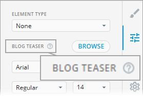 |
type | enum | The property data type according to the JavaScript-supported data types. |
actualType | enum | The component property type imported from the component-types npm package. |
subtype | enum | The component property subtype for File and Array. actualType: File, set subtype to a FileType valueNOTE: The File type ensures that files defined in these properties are automatically included in the production build.actualType: Array, pass an array as the subtype value |
options | array | A list of allowed enum property values. For example, font families for text or image alignment: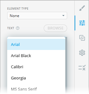 |
required | boolean | Indicates an obligatory property. The possible values are true or false. |
default | string | The default property value. For example, the default top and bottom padding of the button group is 10 pixels: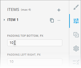 |
required | boolean | Indicates whether the property must be obligatory (required: true) or optional (required: false). When true, your property must be specified. For example, the Element type property is required: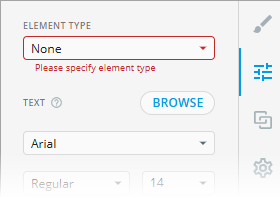 |
sealed | boolean | Sets property restrictions in eWizard Editor > Properties (such as visibility and allowed modification level). sealed: true to define property restrictionssealed: false to discard any property restrictions |
Configure component properties for eWizard Editor
Component properties appear under the Properties tab in eWizard Editor as they're defined in ewizard.config.js in the root of your component project. Here, you can edit the properties previously set in the component's index.vue file.
ewizard.config.js describes component properties in the eWizard-compatible format–using mixin objects that include your required properties.
The language code for labels must be in the ISO 3 format (for example, eng, deu, ukr, etc.). The language of property display in eWizard Editor depends on the language settings of the eWizard account.
For example:
js
import { PropType, FileType } from "component-types"

export default {
    props: {
        textType: {
            label: {
                eng: 'Text'
            },
            actualType: PropType.Text
        },
        booleanType: {
            label: {
                eng: 'Boolean'
            }
        },
        // other settings
    }
}
Override the component configuration
You can override the default property values and define new properties in the ewizard.config.js file.
For this, export your required component and define its values in the ewizard.config.js file located in your content item's project root:
js
// ./demo/ewizard.config.js

import { PropType, FileType } from "component-types"

export default {
   components: {
      'blog-teaser': {
         props: {
            componentName: {
               label: {
                  eng: 'BLOG TEASER',
               },
               actualType: PropType.String,
            },
         }
      }
   }
};
The settings in this configuration file override the blog-teaser property settings in ./demo/node_modules/blog-teaser/ewizard.config.js.
Add attributes to properties
You can add attributes to properties in the ewizard.config.js file to hide the property, restrict editing, validate, and make properties required in eWizard Editor.
Hide and restrict properties
To hide a property in eWizard Editor and restrict its editing, make the following changes in ewizard.config.js:
- Set its
sealedattribute totrue. - Hard-code the default attributes as required.
For example, hide the alt text property for the wiz-image component:
js
// ./demo/node_modules/wiz-image/ewizard.config.js

export default {
  props: {
    alt: {
      sealed: true,
      label: {
        eng: 'Alternative text',
      },
      actualType: PropType.String,
    },
  },
};
To restrict editing certain properties in eWizard Editor, add the properties in the sealed object with the true value.
js
// ./node_modules/wiz-tab-group/components/wiz-tab-group-header/ewizard.config.js

export default {
    sealed: {
      width: true,
      height: true,
      position: true,
      rotation: true,
      delete: true,
      duplicate: true,
    },
    props: {
        //…
    },
};| Property | Locked property in eWizard Editor |
|---|---|
sealed.width: true | Component width |
sealed.height: true | Component height |
sealed.rotation: true | Component rotating on the layout |
sealed.position: true | Component moving on the layout |
sealed.delete: true | Component deletion |
sealed.duplicate: true | Component copying |
Lock width and height
To completely lock modifying the component's width and height, set its readonly attribute to true:
js
stringType: {
   label: {
     eng: 'String'
   },
   actualType: PropType.String,
   readonly: true,
}
Make a property required
To make a property required in eWizard Editor, set the required attribute to true.
js
stringType: {
    label: {
        eng: 'String'
    },
   actualType: PropType.String,
   required: true,
},
Add custom validation logic
To customize component property validation, do the following:
- Assign the
validateattribute to your required property.
You can add this attribute in bothewizard.config.jsorindex.vuefiles.ewizard.comfig.jsis a priority. - Specify the required validation function as the
validatevalue.
For example, the validate function of the min and max properties in the wiz-fragment component:
js
// ./node-modules/@email/wiz-fragment/ewizard.config.js

export default {
  props: {
    min() {
      return{
        label: {
          eng: "Min"
        },
        actualType: PropType.Number,
        sealed: !this.limitFragments,
        validate: function (min) {
          return min <= this.max
        },
      }
    },
    max() {
      return{
        label: {
          eng: "Max"
        },
        actualType: PropType.Number,
        sealed: !this.limitFragments,
        validate: function (max) {
          return max >= this.min
        },
      }
    }
  }
}
The function specified in the example, runs after a user adds or removes the fragments in eWizard Editor and ensures that the minimum value doesn't exceed the maximum value and the maximum value is not lower than the minimum.