Appearance
wiz-scroller
The wiz-scroller component is a scrollable window that you can add to your e-Detailer slides. You can use wiz-scroller to add text, images, and other components that exceed the slide limit.
Learn more about components
Usage
To add the wiz-scroller component to your slide and change its properties, in the ./slides/default/index.vue file:
Add the
<wiz-scroller></wiz-scroller>tag to your slide template.html<!--./slides/default/index.vue --> <template> <wiz-slide> <wiz-scroller> </wiz-scroller> </wiz-slide> </template>Enter the component tags within the
<wiz-scroller></wiz-scroller>tag.For example,
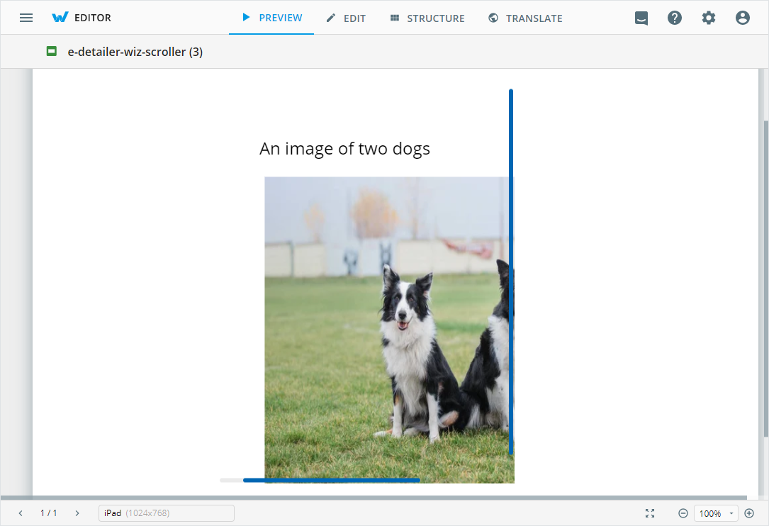
<wiz-text></wiz-text>and<wiz-image></wiz-image>:html<!--./slides/default/index.vue --> <template> <wiz-slide class="editable-block"> <wiz-scroller id="wiz-scroller-e363" class="default" :scrollpanelopts="[{'__label':'Options','initialScrollY':false,'initialScrollX':false,'scrollingX':true,'scrollingY':true,'__id':'7-scrollpanelopts-0'}]" :railopts="[{'__label': 'Options', 'background': 'rgba(99,99,99,0.13)', 'gutterOfEnds': 10, 'opacity': 0, '__id': '7-railopts-0'}]" :baropts="[{'__label':'Options','background':'#0066B3','disable':false,'opacity':50,'keepShow':true,'__id':'7-baropts-0'}]"> <wiz-text :text="$t('text2')" id="wiz-text-4769"></wiz-text> <wiz-image id="wiz-image-8e03" class="default" src="./media/images/222d350c-IMG_20211024_152559014.jpg"></wiz-image> </wiz-scroller> </wiz-slide> </template>The id attribute is required for the correct display of the component styles in eWizard Editor.
Attributes
You can change the wiz-scroller component appearance and behavior using the following attributes within the <wiz-scroller></wiz-scroller> tag:
scrollpaneloptsEdit the value to change the options in the SCROLL PANEL menu of the Properties tab in eWizard Editor.
html<wiz-scroller id="wiz-scroller-e363" class="default" :scrollpanelopts="[{'__label':'Options','initialScrollY':50,'initialScrollX':false,'scrollingX':true,'scrollingY':true,'__id':'7-scrollpanelopts-0'}]"> </wiz-scroller>You can modify the following options of the attribute:
'__label'—the label name displayed in eWizard Editor. For example, to set the name Options, enter:'__label':'Options'.'initialScrollY'—the distance that is scrolled vertically when viewing the component. Set the value in pixels or percents. For example,'initialScrollY':'50'scrolls the window down by 50 px,'initialScrollY':'10%', scrolls down the window by 10% of the maximum window size.'initialScrollX'—the distance that is scrolled horizontally when viewing the component. Set the value in pixels or percents. For example,'initialScrollY':'50'scrolls the window right by 50 px,'initialScrollY':'10%', scrolls the window right by 10% of the maximum window size.'scrollingX'—set the value totrueto enable horizontal scrolling.'scrollingY'—set the value totrueto enable vertical scrolling.'__id'—is required for the correct display of the component styles in eWizard Editor.
railoptsEdit the value to change the scrollbar background options in the RAIL menu of the Properties tab in eWizard Editor.
html<wiz-scroller id="wiz-scroller-e363" class="default" :railopts="[{'__label': 'Options', 'background': 'rgba(99,99,99,0.13)', 'gutterOfEnds': 10, 'opacity': 0, '__id': '7-railopts-0'}]"> </wiz-scroller>You can modify the following options of the attribute:
'__label'—the label name displayed in eWizard Editor. For example, to set the name Options, enter:'__label':'Options'.'background'—the background color of the scrollbars. You can use CSS colors as background colors.'gutterOfEnds'—the distance between the scrollbar and the border of the component in pixels. The option controls the vertical distance for the vertical scrollbar and the horizontal distance to the horizontal scrollbar.'opacity'—the opacity of the scrollbar background in percents. Set to0to make the background transparent. Set to100to make the background color visible.
baroptsEdit the value to change the scrollbar options in the BAR menu of the Properties tab in eWizard Editor.
html<wiz-scroller id="wiz-scroller-e363" class="default" :baropts="[{'__label':'Options','background':'#0066B3','disable':false,'opacity':50,'keepShow':true,'__id':'7-baropts-0'}]"> </wiz-scroller>You can modify the following options of the attribute:
'__label'—the label name displayed in eWizard Editor. For example, to set the name Options, enter:'__label':'Options'.'background'—the color of the scrollbars. You can use CSS colors as scrollbar colors.'disable'—set totrueto hide the scrollbars.'opacity'—the opacity of the scrollbar in percents. Set to0to make the background transparent. Set to100to make the background color visible.'keepShow'—set totrueto keep the scrollbar background visible even if the scrollbar is not visible.
disableSwipeLockSet the value to
trueto be able to swipe slides to the when swiping the slide horizontally. By default, it isn't possible to swipe the slide with awiz-scrollercomponent.
Properties
The following properties are available:
| Property | Type | Default value | Description |
|---|---|---|---|
baropts | string | __label, background, disable, opacity, keepShow | Scrollbar settings |
componentName | string | Scroller | The text label displayed in eWizard Editor. |
disableSwipeLock | boolean | false | Swiping settings for the slide. When true, you can swipe slides horizontally. |
railopts | string | __label, background, gutterOfEnds, opacity | Scrollbar background settings. |
scrollpanelopts | string | __label, scrollingX, scrollingY | Horizontal and vertical sidebars settings. |