Appearance
Property and file types
This article describes the property types available in the eWizard.js framework that extend Vue's standard props system. The property types described here allow rich editing experiences in the eWizard Editor while maintaining compatibility with Vue.js component model.
Property types
The component-types npm package contains the following values for the PropType objects:
ts
// ./node_modules/component-types/src/prop-types/PropType.ts

export enum PropType {
    Array = 'array',
    Boolean = 'boolean',
    Color = 'color',
    Enum = 'enum',
    File = 'file',
    Number = 'number',
    Object = 'object',
    String = 'string',
    Text = 'text',
    Url = 'url',
    Link = 'link',
    LinkedText = 'linked-text',
    Textarea = 'textarea',
    VaultRemoteObjectList = 'vault-remote-object-list',
    Date = 'date',
    Time = 'time',
    TimeRange = 'time-range',
    IcsCalendar = 'ics-calendar',
    TableView = 'table-view',
    Slide = 'slide',
    Slides = 'slides',
    Chapter = 'chapter',
    Chapters = 'chapters',
    FixedText = 'fixed-text',
    Border = 'border',
    Layout = 'layout'
};| Property type | Data type | Name | Description |
|---|---|---|---|
| array | array | Array | Allows passing an array of values. For example, a collection of slides or a group of radio buttons. |
| boolean | boolean | Boolean | Allows setting a boolean value (true or false). For example, if the transition between the slides is active. |
| city-time | string | CityTime, probably | The wiz-event-invitation component property to generate a list of cities that belong to a specific timezone. |
| color | string | Color | The color property of a component |
| enum | array | Enum | The list of allowed values for the component property used for drop-down lists or checkboxes. |
| file | string | File | The file asset that you can upload from your device or use an existing asset from eWizard Library or Veeva Vault. This property type must have the `FileType` subtype. For example, an image has the `file` property type and the `image` subtype. |
| number | boolean | Number | Allows entering a numeric value. |
| object | TBD | Object | The object with options for the property. For example, the scroll options. |
| string | string | String | TBD |
| text | string | Text | The text property of the component. For example, the tab or header text. |
| url | string | Url | The URL link property type. |
| link | string | Link | The subtype of the `ics-calendar` property type. For example, it is used for the URL link generated to add an event to the calendar. |
| linked-text | string | LinkedText | This is a subtype for the `ics-calendar` property type. For example, this property type is used for the URL link generated for adding an event to the calendar. |
| text-area | TBD | Textarea | TBD: The multiple strings of text. For example, the Description field. |
| vault-remote-object-list | array | VaultRemoteObjectList | No support in eWizard Editor |
| date | date | Date | A subtype for of the ics-calendar property type. For example, the Date field where you can enter a string of text or pick the date from the pop-up calendar. |
| time | string | Time | A subtype of the ics-calendar property type. For example, the From and To fields where you can enter a string of text or pick the time in the timepicker. |
| time-range | TBD | TimeRange | This property type includes the from and to subtypes from the time property type. For example, the time range in the ics-calendar property type. |
| isc-calendar | string | IcsCalendar | An iCalendar subscription (ICS) feed for Google Calendar, Microsoft Office 365, MacOS iOS calendar. Includes the name, date, time, timezone, location, description, and link subtypes. |
| isc-calendar-extended | string | TBD | An iCalendar subscription (ICS) feed for Google Calendar, Microsoft Office 365, MacOS iOS calendar. Includes the name, location, description, and link subtypes. |
| table-view | TBD | TableView | No support in eWizard Editor |
| slide | TBD | Slide | A pop-up window for selecting a single slide |
| slides | TBD | Slides | A pop-up window for selecting multiple slide |
| chapter | TBD | Chapter | Allows adding the Chapter drop-down menu to the Properties tab in eWizard Editor. |
| chapters | TBD | Chapters | Allows adding the Chapter drop-down menu to the Properties tab in eWizard Editor. |
| fixed-text | TBD | FixedText | Create the text property to edit the text in eWizard Editor without possibility to change the styles for this text. The text editing buttons in Editor are in read-only mode |
| border | string | Border | The standard CSS border property: the border line width, color, and style (solid, dotted, etc.). |
| layout | TBD | Layout | Allows creating components with multiple nesting levels. |
array
An array of items where each item has a set of properties. The default value must be included in the default index.vue file.
The array property type supports nested objects if the actualType field in the arrayType matches the actualType field in the subtype. For example:
js
arrayType: {
      label: 'Array',
      actualType: PropType.Array,
      subtype: {
          arrayType: {
          label: 'Data',
          defaultLabel: 'Item',
          actualType: PropType.Array,
          subtype: {
            value: {
              …
            },
          },
        },
      }
    }
ewizard.config.js example:
js
import {PropType, FileType} from "src/docs/guide/general-development/component-setup";

export default {
    props: {
        componentName: {
            label: {
                eng: "Component name",
            },

            actualType: PropType.String,
        },

        arrayType: {
            label: "Array",
            defaultLabel: "Item label",
            minLength: 1, // 0 - by default
            maxLength: 7, // Infinity - by default
            actualType: PropType.Array,
            subtype: {
                prop1: {
                    label: {
                        eng: "Text label 1",
                    },
                    type: String,
                    actualType: PropType.String,
                },
                prop2: {
                    label: {
                        eng: "Text label 2",
                    },
                    type: String,
                    actualType: PropType.Text,
                },
                prop3: {
                    label: {
                        eng: "Color",
                    },
                    type: String,
                    actualType: PropType.Color,
                },
                prop4: {
                    label: {
                        eng: "Image",
                    },
                    type: String,
                    actualType: PropType.File,
                    subtype: FileType.Image,
                },
                arrayType: {
                    label: "Data",
                    defaultLabel: "Item",
                    actualType: PropType.Array,
                    subtype: {
                        value: {
                            label: "Value",
                            actualType: PropType.Number,
                        },
                    },
                },
            },
        },
    },
};
The minLength field must be included in ewizard.config.js to add properties in eWizard Editor after removing all properties.
index.vue example:
html
<template>
<p class="array-prop-component">Array prop</p>
</template>
<script>
export default {
name: "array-prop-component",
props: {
arrayType: {
type: Array,
default() {
return [
{
prop1: "String",
prop2: "Text",
prop3: "#000000",
prop4: "",
arrayType: [
{
value: 40,
},
{
value: 85,
},
{
value: 75,
},
],
},
];
},
},
},
data() {
return {};
},
};
</script>
<style scoped>
.array-prop-component {
width: 200px;
}
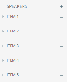
</style>For example, the speakers array in the wiz-agenda email component.
How the property is used in the email App.vue file:
html
<!-- App.vue -->

<wiz-agenda
    :speakers="[
    {
        timeFrom: $t('wiz_agenda_speakers_timeFrom_d1c9'),
        timeSeparator: '',
        timeTill: $t('wiz_agenda_speakers_timeTill_5979'),
        description: $t('wiz_agenda_speakers_description_d591'),
        speaker: $t('wiz_agenda_speakers_speaker_cc4a'),
        __label: 'Item 1',
        __id: '25-speakers-0',
    },
    {
        timeFrom: $t('wiz_agenda_speakers_timeFrom_4cdb'),
        timeSeparator: '',
        timeTill: $t('wiz_agenda_speakers_timeTill_e372'),
        description: $t('wiz_agenda_speakers_description_e138'),
        speaker: $t('wiz_agenda_speakers_speaker_4cc1'),
        __label: 'Item 2',
        __id: '25-speakers-1',
    },
    {
        timeFrom: $t('speakers_timeFrom_c79d'),
        timeSeparator:
        '<div style=\'line-height: 20px;text-align: left;\'><span style=\'font-size:14px;color:#000000;font-family:arial,helvetica neue,helvetica,sans-serif;\'>-</span></div>',
        timeTill: $t('speakers_timeTill_c6ae'),
        description: $t('speakers_description_ef1d'),
        speaker: $t('speakers_speaker_010f'),
        label: null,
    },
    ]"
    id="wiz-agenda-d26a"
    :is-time="true"
></wiz-agenda>
How it looks like in eWizard Editor:
boolean
The true or false value. If the default value isn't defined in index.vue, the default value is false.
ewizard.config.js example:
js
import {PropType} from "src/docs/guide/general-development/component-setup";

export default {
    props: {
        componentName: {
            label: {
                eng: "Component name",
            },
            actualType: PropType.String,
        },
        booleanType: {
            label: {
                eng: "Show text",
            },
            actualType: PropType.Boolean,
        },
    },
};
index.vue example:
html
<template>
  <p class="boolean-prop" v-show="booleanType">Boolean prop</p>
</template>

<script>
  export default {
    name: "boolean-prop",

    props: {
      booleanType: {
        type: Boolean,
        label: "Show text",
        default: true, // false - default value
        actualType: PropType.Boolean,
      },
    },
    data() {
      return {};
    },
  };
</script>

<style scoped>
  .boolean-prop {
    width: 200px;
  }
</style>
The actualType isn't defined in the booleanType, because the value of actualType matches the type.
For example, the fullWidth property of the wiz-button email component. In eWizard Editor, the selected checkbox corresponds to true and the cleared checkbox—to false.
How the property is used in the email App.vue file:
html
<wiz-button :full-width="true"></wiz-button>How it looks like in eWizard Editor:
city-time
The property that is used in the wiz-event-invitation component to generate a list of cities that belong to a specific timezone.
color
The component CSS color.
ewizard.config.js example:
js
import {PropType} from "src/docs/guide/general-development/component-setup";

export default {
    props: {
        componentName: {
            label: {
                eng: "Component name",
            },
            actualType: PropType.String,
        },
        textColor: {
            label: {
                eng: "Text color",
            },
            actualType: PropType.Color,
        },
    },
};
index.vue example:
html
<template>
<wiz-text
id="loremText"
class="lorem-text"
:text="`<p style=\'text-align: center;\'><span style=\'font-family: Avenir; font-size: 16px; color: ${textColor}\'>Lorem ipsum</span></p>`"
></wiz-text>
</template>
<script>
export default {
name: "color-prop",
props: {
componentName: {
type: String,
default: "Color property",
},
textColor: {
type: String,
default: "#000000",
},
},
};
</script>
<style scoped>
.wiz-text.lorem-text {
width: 200px;
}
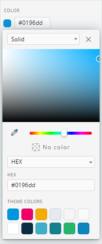
</style>For example, the dividerColor property of the wiz-divider email component.
eWizard Editor supports hex and RGBA color values. For more information, see CSS colors
How the property is used in the email App.vue file:
html
<wiz-divider divider-color="#0196dd"></wiz-divider>How it looks like in eWizard Editor:
enum
The list of values, displayed in a drop-down in eWizard Editor.
If the default value isn't defined in index.vue, the value isn't defined in the component properties.
ewizard.config.js example:
js
import {PropType} from "src/docs/guide/general-development/component-setup";

export default {
    props: {
        componentName: {
            label: {
                eng: "Component name",
            },
            actualType: PropType.String,
        },
        enumType: {
            label: {
                eng: "Enum",
            },
            actualType: PropType.Enum,
            options: [
                {
                    value: "value 1",
                    label: {
                        eng: "Label 1",
                    },
                },
                {
                    value: "value 2",
                    label: {
                        eng: "Label 2",
                    },
                },
            ],
        },
    },
};
index.vue example:
html
<template>
<div class="enum-prop">
<p>Enum Prop</p>
<p>{{ enumType }}</p>
</div>
</template>
<script>
import {PropType} from "src/docs/guide/general-development/component-setup";
export default {
name: "enum-prop",
props: {
enumType: {
type: String,
label: "Enum",
actualType: PropType.Enum,
default: "value 1",
},
},
};
</script>
<style scoped>
.enum-prop {
display: flex;
justify-content: space-between;
align-items: center;
width: 200px;
}
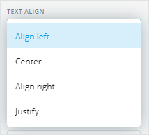
</style>For example, the textAlign property of the wiz-button email component.
How the property is used in the email App.vue file:
html
<wiz-button :text-align="'center'"></wiz-button>How it looks like in eWizard Editor:
file
The file asset you can upload from your device or use an existing one from eWizard Library or Veeva Vault. This property type must have the FileType subtype.
ewizard.config.js example:
js
import {PropType, FileType} from "src/docs/guide/general-development/component-setup";

export default {
    props: {
        componentName: {
            label: {
                eng: "Component name",
            },
            actualType: PropType.String,
        },
        fileTypeAudio: {
            label: {
                eng: "Audio",
            },
            actualType: PropType.File,
            subtype: FileType.Audio,
        },
        fileTypeImage: {
            label: {
                eng: "Image",
            },
            actualType: PropType.File,
            subtype: FileType.Image,
        },
        fileTypeVideo: {
            label: {
                eng: "Video",
            },
            actualType: PropType.File,
            subtype: FileType.Video,
        },
        fileTypeModule: {
            label: {
                eng: "Module",
            },
            actualType: PropType.File,
            subtype: FileType.Module,
        },
        fileTypeDocument: {
            label: {
                eng: "Module",
            },
            actualType: PropType.File,
            subtype: FileType.Document,
        },
    },
};
index.vue example:
html
<template>
    <p class="file-prop">File prop</p>
</template>

<script>
    import {PropType, FileType} from "src/docs/guide/general-development/component-setup";

    export default {
        name: "file-prop",

        props: {
            fileTypeAudio: {
                type: String,
                label: "Audio",
                actualType: PropType.File,
                subtype: FileType.Audio,
                default: "./path/to/audio.mp3",
            },
            fileTypeImage: {
                type: String,
                label: "Image",
                actualType: PropType.File,
                subtype: FileType.Image,
                default: "./path/to/image.png",
            },
            fileTypeVideo: {
                type: String,
                label: "Video",
                actualType: PropType.File,
                subtype: FileType.Video,
                default: "./path/to/video.mp4",
            },
            fileTypeModule: {
                type: String,
                label: "Module",
                actualType: PropType.File,
                subtype: FileType.Module,
                default: "./path/to/module.pdf",
            },
        },
        data() {
            return {};
        },
    };
</script>

<style scoped>
    .file-prop {
        width: 200px;
    }
</style>
For example, the src property of the wiz-image email component has the file property type and the image subtype.
How the property is used in the email App.vue file:
html
<wiz-image src="./common/media/images/37022210-5d7b-11ec-b91a-85800ef85ec4.png"></wiz-image>How the property looks like in eWizard Editor:
number
The property with a numeric value. The value in eWizard Editor can't be less than 0. If the default value isn't defined in index.vue, the default value is an empty string.
ewizard.config.js example:
js
import {PropType} from "src/docs/guide/general-development/component-setup";

export default {
    props: {
        componentName: {
            label: {
                eng: "Component name",
            },
            actualType: PropType.String,
        },
        numberType: {
            label: {
                eng: "Number",
            },
            actualType: PropType.Number,
        },
    },
};
index.vue example:
html
<template>
  <p class="number-prop">Number prop: {{ numberType }}</p>
</template>

<script>
  export default {
    name: "number-prop",
    props: {
      numberType: {
        type: Number,
        label: "Number",
        default: 1, // '' - default value
        actualType: PropType.Number,
      },
    },

    data() {
      return {};
    },
  };
</script>

<style scoped>
  .number-prop {
    width: 200px;
  }
</style>
For example, the lineHeight property of the wiz-button email component.
How the property is used in the email App.vue file:
html
<wiz-button :line-height="22"></wiz-button>How the property looks like in eWizard Editor:

object
The object with options for the property. For example, the scroll options. The property supports two or more nesting levels.
ewizard.config.js example:
js
import {PropType} from "src/docs/guide/general-development/component-setup";

export default {
    props: {
        componentName: {
            label: {
                eng: "Component name",
            },
            actualType: PropType.String,
        },
        objectType: {
            label: {
                eng: "Object",
            },
            objectType: {
                type: PropType.Object,
                subtype: {
                    parentProp1: {
                        actualType: PropType.String,
                    },
                    parentProp2: {
                        actualType: PropType.Text,
                    },
                    parentProp3: {
                        actualType: PropType.Object,
                        subtype: {
                            childProp1: {
                                actualType: PropType.String,
                            },
                            childProp2: {
                                actualType: PropType.Text,
                            },
                            childProp3: {
                                actualType: PropType.Object,
                                subtype: {
                                    childProp1: {
                                        actualType: PropType.String,
                                    },
                                    childProp2: {
                                        actualType: PropType.Text,
                                    },
                                },
                            },
                        },
                    },
                },
            },
        },
    },
};
index.vue example:
html
<template>
    <p class="object-prop">Object prop</p>
</template>

<script>
    import {PropType} from "src/docs/guide/general-development/component-setup";

    export default {
        name: "object-prop",

        props: {
            objectType: {
                type: Object,
                label: "Object",
                actualType: {
                    type: PropType.Object,
                    subtype: {
                        parentProp1: String,
                        parentProp2: {
                            type: String,
                            actualType: PropType.Text,
                        },
                        parentProp3: {
                            type: PropType.Object,
                            subtype: {
                                childProp1: String,
                                childProp2: {
                                    type: String,
                                    actualType: PropType.Text,
                                },
                                childProp3: {
                                    type: PropType.Object,
                                    subtype: {
                                        childProp1: String,
                                        childProp2: {
                                            type: String,
                                            actualType: PropType.Text,
                                        },
                                    },
                                },
                            },
                        },
                    },
                },

                default: () => {
                    return {
                        parentProp1: "Parent String 1",
                        parentProp2: "Parent String 2",
                        parentProp3: {
                            childProp1: "Child String 1",
                            childProp2: "Child String 2",
                            childProp3: {
                                childProp1: "Child String 1",
                                childProp2: "Child String 2",
                            },
                        },
                    };
                },
            },
        },

        data() {
            return {};
        },
    };
</script>

<style scoped>
    .object-prop {
        width: 200px;
    }
</style>
string
The string of text for the component properties with text. If the default value isn't defined in index.vue, the default value is an empty string.
ewizard.config.js example:
js
import {PropType} from "src/docs/guide/general-development/component-setup";

export default {
    props: {
        componentName: {
            label: {
                eng: "Component name",
            },
            actualType: PropType.String,
        },
        stringType: {
            label: {
                eng: "String",
            },
            actualType: PropType.String,
        },
    },
};
index.vue example:
html
<template>
  <p class="string-prop">String prop: {{ stringType }}</p>
</template>

<script>
  export default {
    name: "string-prop",
    props: {
      stringType: {
        type: String,
        default: "Lorem ipsum", // '' - default value
      },
    },

    data() {
      return {};
    },
  };
</script>

<style scoped>
  .string-prop {
    width: 200px;
  }
</style>
For example, the componentName of the wiz-text e-Detailer component.
How the property is used in the e-Detailer index.vue file:
html
<wiz-text component-name="Text"></wiz-text>How the property looks like in eWizard Editor:

text
The text property of the component. If the default value isn't defined in index.vue, the default value is an empty string.
ewizard.config.js example:
js
import {PropType} from "src/docs/guide/general-development/component-setup";

export default {
    props: {
        componentName: {
            label: {
                eng: "Component name",
            },
            actualType: PropType.String,
        },
        textType: {
            label: {
                eng: "Show text",
            },
            actualType: PropType.Text,
        },
    },
};
index.vue example:
html
<template>
<p class="text-prop">Text prop: {{ textType }}</p>
</template>
<script>
export default {
name: "text-prop",
components: {},
props: {
textType: {
type: String,
default: "Lorem ipsum", // '' - default value
},
},
data() {
return {};
},
methods: {},
mounted() {},
};
</script>
<style scoped>
.text-prop {
width: 200px;
}
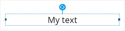
</style>For example, the text property of the wiz-text e-Detailer component.
You can use the <i18n></i18n> tag to add localization to the text. For more information, see Localization.
How the property is used in the e-Detailer slide index.vue file:
html
<wiz-text :text="$t('heading')"></wiz-text>How the property looks like in eWizard Editor:
url
A URL link. If the default value isn't defined in index.vue, the default value is an empty string.
ewizard.config.js example:
js
import {PropType} from "src/docs/guide/general-development/component-setup";

export default {
    props: {
        componentName: {
            label: {
                eng: "Component name",
            },
            actualType: PropType.String,
        },
        urlType: {
            label: {
                eng: "Url",
            },
            actualType: PropType.Url,
        },
    },
};
index.vue example:
html
<template>
  <p class="url-prop">Url prop: {{ urlType }}</p>
</template>

<script>
  export default {
    name: "url-prop",
    props: {
      urlType: {
        type: String,
        default: "https://viseven.com", // '' - default value
      },
    },

    data() {
      return {};
    },
  };
</script>

<style scoped>
  .url-prop {
    width: 200px;
  }
</style>
For example, the link property in the wiz-button email component.
How the property is used in the email App.vue file:
html
<wiz-button :link="'https://viseven.com/'"></wiz-button>How the property looks like in eWizard Editor:

linked-text
The text that redirects to a link after you click it. If the default value isn't defined in index.vue, the default value is Click to add text.
ewizard.config.js example:
js
import {PropType} from "src/docs/guide/general-development/component-setup";

export default {
    props: {
        componentName: {
            label: {
                eng: "Component name",
            },
            actualType: PropType.String,
        },
        linkedTextType: {
            label: {
                eng: "Linked text",
            },
            actualType: PropType.LinkedText,
        },
    },
};
index.vue example:
html
<template>
  <p class="linked-text-prop">Linked text: {{ linkedTextType }}</p>
</template>

<script>
  export default {
    name: "linked-text-prop",
    props: {
      linkedTextType: {
        type: String,

        default: "Lorem ipsum", //'Click to add text' - default value
      },
    },

    data() {
      return {};
    },
  };
</script>

<style scoped>
  .linked-text-prop {
    width: 200px;
  }
</style>
For example, the text property of the wiz-button email component.
How the property is used in the email App.vue file:
html
<wiz-button :text="$t('wiz_button_8f1e')"></wiz-button>How the property looks like in eWizard Editor:

text-area
Multiple strings of text. If the default value isn't defined in index.vue, the default value is an empty string.
ewizard.config.js example:
js
import {PropType} from "src/docs/guide/general-development/component-setup";

export default {
    props: {
        componentName: {
            label: {
                eng: "Component name",
            },
            actualType: PropType.String,
        },
        textareaType: {
            label: {
                eng: "Show text",
            },
            actualType: PropType.Textarea,
        },
    },
};
index.vue example:
html
<template>
  <p class="textarea-prop">Text area: {{ textareaType }}</p>
</template>

<script>
  export default {
    name: "textarea-prop",
    props: {
      textareaType: {
        type: String,
      },
    },
    data() {
      return {};
    },
  };
</script>

<style scoped>
  .textarea-prop {
    width: 200px;
  }
</style>
How the property looks like in eWizard Editor:

link
This property type isn't supported in eWizard Editor.
vault-remote-object-list
This property type isn't supported in eWizard Editor.
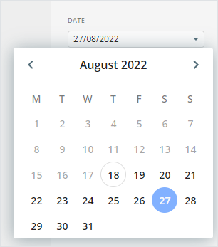
date
This is a subtype for the ics-calendar property type. For example, the Date field where you can enter a string of text or pick the date from the pop-up calendar.
The default value format is YYYY/MM/DD. If the default value isn't defined in index.vue, the default value is an empty string.
ewizard.config.js example:
js
import {PropType} from "src/docs/guide/general-development/component-setup";

export default {
    props: {
        componentName: {
            label: {
                eng: "Component name",
            },
            actualType: PropType.String,
        },
        dateType: {
            label: {
                eng: "Date",
            },
            actualType: PropType.Date,
        },
    },
};
index.vue example:
html
<template>
  <p class="date-prop">Date prop: {{ dateType }}</p>
</template>

<script>
  export default {
    name: "date-prop",
    components: {},
    props: {
      dateType: {
        type: String,
        default: "2022/06/10",
      },
    },
    data() {
      return {};
    },
    methods: {},
    mounted() {},
  };
</script>

<style scoped>
  .date-prop {
    width: 200px;
  }
</style>
How the property looks like in eWizard Editor:
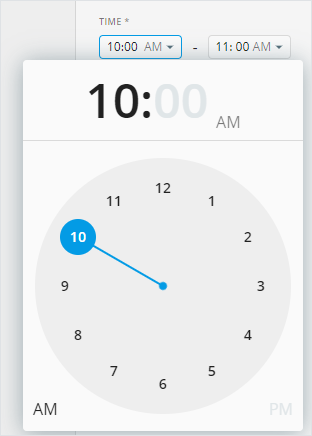
time
This property type isn't supported in eWizard Editor.
time-range
This property type includes the from and to subtypes from the time property type. For example, the time range in the ics-calendar property type. If the default value isn't defined in index.vue, the default value is an empty string.
ewizard.config.js example:
js
import {ComponentConfig, PropType} from "src/docs/guide/general-development/component-setup";

export default {
    props: {
        componentName: {
            label: {
                eng: "Component name",
            },
            actualType: PropType.String,
        },
        timeRange: ComponentConfig.TimeRange,
    },
};
index.vue example:
html
<template>
    <p class="time-range-prop">
        Time range: {{ timeRange.from }} - {{ timeRange.to }}
    </p>
</template>

<script>
    import {PropType} from "src/docs/guide/general-development/component-setup";

    export default {
        name: "time-range-prop",
        props: {
            timeRange: {
                type: Object,
                label: "Time range",
                actualType: PropType.TimeRange,
                subtype: {
                    from: String,
                    to: String,
                },

                default: () => {
                    return {
                        from: "10:00", // AM format
                        to: "11: 00", // AM format
                        // from: '14:00', // PM format
                        // to: '15: 00',  // PM format
                    };
                },
            },
        },

        data() {
            return {};
        },
    };
</script>

<style scoped>
    .time-range-prop {
        width: 200px;
    }
</style>
How the property looks like in eWizard Editor:
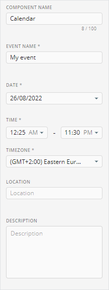
ics-calendar
This property type includes the name, date, time, timezone, location, description, and link subtypes. This is an iCalendar subscription (ICS) feed for Google Calendar, Microsoft Outlook/Office 365, macOS/iOS calendar. For example, click this link to add an event to the calendar.
The default value is required.
ewizard.config.js example:
js
import {ComponentConfig, PropType} from "src/docs/guide/general-development/component-setup";

export default {
    props: {
        componentName: {
            label: {
                eng: "Component name",
            },
            actualType: PropType.String,
        },
        icsCalendar: ComponentConfig.IcsCalendar,
    },
};
index.vue example:
html
<template>
    <p class="ics-calendar-prop">Ics calendar</p>
</template>

<script>
    import {PropType} from "src/docs/guide/general-development/component-setup";

    export default {
        name: "ics-calendar-prop",
        components: {},
        props: {
            icsCalendar: {
                type: Object,
                default() {
                    return {
                        name: "",
                        date: "",
                        time: {
                            from: "",
                            to: "",
                        },
                        timezone: "",
                        location: "",
                        description: "",
                        link: "",
                    };
                },
                subtype: {
                    name: {
                        type: String,
                        default: "",
                    },
                    date: {
                        type: String,
                        default: "",
                    },
                    time: {
                        type: Object,
                        default: {
                            from: "",
                            to: "",
                        },
                    },
                    timezone: {
                        type: String,
                        default: "",
                    },
                    location: {
                        type: String,
                        default: "",
                    },
                    description: {
                        type: String,
                        default: "",
                    },
                    link: {
                        type: String,
                        default: "",
                    },
                },
            },
        },

        data() {
            return {};
        },

        methods: {},
        mounted() {
        },
    };
</script>

<style scoped>
    .ics-calendar-prop {
        width: 200px;
    }
</style>
How the property looks like in eWizard Editor:
ics-calendar-extended
This property type includes the name, location, description, and link subtypes. This is an iCalendar subscription (ICS) feed for Google Calendar, Microsoft Outlook/Office 365, macOS/iOS calendar. For example, to download an ICS file by clicking a button in the wiz-event-invitation component.
ewizard.config.js example:
js
import { PropType, ComponentConfig } from '@ewizardjs/component-types';

export default {
  props: {
    icsCalendar: ComponentConfig.IcsCalendarExtended,
    text: {
      label: {
        eng: 'Button text',
        deu: 'Schaltflächentext',
        esp: 'Texto del botón',
        rus: 'Текст кнопки',
        ukr: 'Текст кнопки',
        fra: 'Texte du bouton'
      },
      actualType: PropType.LinkedText,
    }
  }
};
table-view
This property type isn't supported in eWizard Editor.
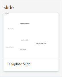
slide
This property type provides a pop-up window for selecting a single slide. If the default value isn't defined in index.vue, the default value is null.
ewizard.config.js example:
js
import {PropType} from "src/docs/guide/general-development/component-setup";

export default {
    props: {
        componentName: {
            label: {
                eng: "Component name",
            },
            actualType: PropType.String,
        },
        slideType: {
            label: {
                eng: "Slide",
            },
            actualType: PropType.Slide,
        },
    },
};
index.vue example:
html
<template>
  <p class="slide-prop">Slide prop: {{ slideType.slide }}</p>
</template>

<script>
  export default {
    name: "slide-prop",
    props: {
      slideType: {
        type: Object,

        default: () => {
          return {
            slide: "default",

            chapter: "main",
          };
        },
      },
    },

    data() {
      return {};
    },
  };
</script>

<style scoped>
  .slide-prop {
    width: 200px;
  }
</style>
How the property looks like in eWizard Editor:
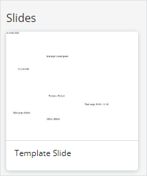
slides
This property type provides a pop-up window for selecting multiple e-Detailer slides. If the default value isn't defined in index.vue, the default value is null.
ewizard.config.js example:
js
import {PropType} from "src/docs/guide/general-development/component-setup";

export default {
    props: {
        componentName: {
            label: {
                eng: "Component name",
            },
            actualType: PropType.String,
        },
        slidesType: {
            label: {
                eng: "Slides",
            },
            actualType: PropType.Slides,
        },
    },
};
index.vue example:
html
<template>
  <p class="slides-prop">
    Slides:

    <span v-for="(slide, index) in slidesType" :key="index">
      {{ slide.slide }}
    </span>
  </p>
</template>

<script>
  export default {
    name: "slides-prop",
    props: {
      slidesType: {
        type: Array,
        default: () => {
          return [
            {
              slide: "default",
              chapter: "main",
            },
          ];
        },
      },
    },

    data() {
      return {};
    },
  };
</script>

<style scoped>
  .slides-prop {
    width: 200px;
  }
</style>
How the property looks like in eWizard Editor:
chapter
Use this property type to add the Chapter drop-down menu to the Properties tab within the customization panel in eWizard Editor.
If the default value isn't defined in index.vue, the default value is the first chapter from the storyboard object. Enter the chapter ID from the chapters object as the default value.
ewizard.config.js example:
js
import {PropType} from "src/docs/guide/general-development/component-setup";

export default {
    props: {
        componentName: {
            label: {
                eng: "Component name",
            },
            actualType: PropType.String,
        },
        chapterType: {
            label: {
                eng: "Chapter",
            },
            actualType: PropType.Chapter,
        },
    },
};
index.vue example:
html
<template>
  <p class="chapter-prop">Chapter prop: {{ chapterType }}</p>
</template>

<script>
  export default {
    name: "chapter-prop",
    props: {
      chapterType: {
        type: String,
        default: "chapter2", // chapter id
      },
    },

    data() {
      return {};
    },
  };
</script>

<style scoped>
  .chapter-prop {
    width: 200px;
  }
</style>
How the property looks like in eWizard Editor:

chapters
Use this property type to add the Chapters drop-down menu to the Properties tab within the customization panel in eWizard Editor. If the default value isn't defined in index.vue, the default value is an empty array.
ewizard.config.js example:
js
import {PropType} from "src/docs/guide/general-development/component-setup";

export default {
    props: {
        componentName: {
            label: {
                eng: "Component name",
            },
            actualType: PropType.String,
        },
        chaptersType: {
            label: {
                eng: "Chapters",
            },
            actualType: PropType.Chapters,
        },
    },
};
index.vue example:
html
<template>
  <p class="chapters-prop">
    Chapters prop:
    <span v-for="(chapter, index) in chaptersType" :key="index">
      {{ chapter }}
    </span>
  </p>
</template>

<script>
  export default {
    name: "chapters-prop",
    props: {
      chaptersType: {
        type: Array,
        default: () => {
          return ["main", "chapter2"];
        },
      },
    },

    data() {
      return {};
    },
  };
</script>

<style scoped>
  .chapters-prop {
    width: 200px;
  }
</style>
How the property looks like in eWizard Editor:

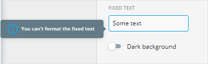
fixed-text
Create the text property to edit the text in eWizard Editor without the possibility of changing the styles for this text. The text editing buttons in Editor are read-only.
ewizard.config.js example:
js
import {PropType} from "src/docs/guide/general-development/component-setup";

export default {
    props: {
        componentName: {
            label: {
                eng: "Component name",
            },
            actualType: PropType.String,
        },
        textFixedType: {
            label: {
                eng: "Fixed text",
            },
            actualType: PropType.FixedText,
            readonly: true,
        },
    },
};
index.vue example:
html
<template>
  <p class="text-fixed-prop">Fixed text: {{ textFixedType }}</p>
</template>

<script>
  export default {
    name: "text-fixed-prop",
    props: {
      textFixedType: {
        type: String,
        default: "Some text",
      },
    },

    data() {
      return {};
    },
  };
</script>

<style scoped>
  .text-fixed-prop {
    width: 200px;
  }
</style>
How the property looks like in eWizard Editor:
border
The standard CSS border properties are the line width, color, and style (solid, dotted, etc.). For example, the selected tab border in the wiz-tab-group component.
ewizard.config.js example:
js
import {PropType} from "src/docs/guide/general-development/component-setup";

export default {
    props: {
        componentName: {
            label: {
                eng: "Component name",
            },
            actualType: PropType.String,
        },
        borderType: {
            label: {
                eng: "Border",
            },
            actualType: PropType.Border,
        },
    },
};
index.vue example:
html
<template>
  <div class="border-prop">
    <p :style="`border: ${borderType}`">Border prop</p>
  </div>
</template>

<script>
  export default {
    name: "border-prop",
    props: {
      borderType: {
        type: String,
        default: "5px solid #000000",
      },
    },

    data() {
      return {};
    },
  };
</script>

<style scoped>
  .border-prop {
    width: 200px;
  }
</style>
How the property looks like in eWizard Editor:

layout
Use the layout property to create components with multiple nesting levels. For example, wiz-tab-group.
The layout property must be defined only in the ewizard.config.js file of the component.
The actualType object defines the parent and child components.
js
props: {
  tabs: {
    label: 'Tabs',
    defaultLabel: 'Tab',
    actualType: {
      type: PropType.Layout,
      options: {
        layout: [
          {
            parent: 'wiz-tab-group-header',
            child: 'wiz-tab-group-button',
          },
          {
            parent: 'wiz-tab-group-body',
            child: 'wiz-tab-group-item',
          },
        ],
      },
    },
    minLength: 1,
  },
},
Use minLength and maxLength properties to configure the minimum and maximum amount of tabs you can add in Editor. For example, if the minLength is 1, and the maxLength is 4, you can't have less than 1 tab and more than 4 tabs in the tab group.
A parent component is a component that includes one or more child components.
Each layout component must have the componentType defined as ComponentType.Layout.
For example, the wiz-tab-group component is a layout:
js
// ./node_modules/@edetailer/wiz-tab-group/components/wiz-tab-group/ewizard.config.js

import { ComponentType, PropType } from '@ewizardjs/component-types';
import { IconPosition, Orientation } from '../types';

export default {
  componentType: ComponentType.Layout,
  sealed: {
    rotation: true,
  },
  props: {
    tabs: {
      label: 'Tabs',
      defaultLabel: 'Tab',
      actualType: {
        type: PropType.Layout,
        options: {
          layout: [
            {
              parent: 'wiz-tab-group-header',
              child: 'wiz-tab-group-button',
            },
            {
              parent: 'wiz-tab-group-body',
              child: 'wiz-tab-group-item',
            },
          ],
        },
      },
      minLength: 1,
    },
  },
};
The parent component of the layout must have the componentType defined as ComponentType.LayoutParent.
For example, the wiz-tab-group-body component inside the wiz-tab-group component is a LayoutParent that includes other elements of the tab group:
js
// ./node_modules/@edetailer/wiz-tab-group/components/wiz-tab-group-body/ewizard.config.js

import { ComponentType } from '@ewizardjs/component-types';

export default {
  componentType: ComponentType.LayoutParent,
  sealed: {
    width: true,
    height: true,
    position: true,
    rotation: true,
  },
};
Components with Layout and LayoutParent type must have a <slot> tag in the template.
The child component of the layout must have the componentType defined as ComponentType.LayoutChild. The child component must also include the layoutPropName—the name of the layout component property that includes the LayoutChild.
For example, the wiz-tab-group-button inside the wiz-tab-group component is a LayoutChild stored in the wiz-tab-group-body:
js
// ./node_modules/@edetailer/wiz-tab-group/components/wiz-tab-group-button/ewizard.config.js

import { ComponentType } from '@ewizardjs/component-types';

export default {
  componentType: ComponentType.LayoutChild,
  layoutPropName: 'tabs',
  sealed: {
    width: true,
    height: true,
    position: true,
    rotation: true,
  },
};
File types
The component-types npm package contains the following values for the FileType objects:
ts
// ./node_modules/component-types/src/prop-types/FileType.ts

export enum FileType {
    Audio = 'audio',
    Image = 'image',
    Video = 'video',
    Module = 'module',
    Document = 'document',
};| File type | Name | Description |
|---|---|---|
| audio | Audio | Supported formats: AAC, MP3, OGG, WAV, WMA. Not available for modification in eWizard Editor. |
| image | Image | Supported formats: GIF, JPEG, JPG, PJPEG, PNG. |
| video | Video | Supported formats: MOV, MP4. |
| module | Module | Veeva Vault modules for upload to email blocks. |
| document | Document | Supported formats: CSV, DOC, DOCX, HTML, PDF, TXT, XLS, XLSX. |
You can upload a required asset to eWizard Editor from your device or use the existing assets from eWizard Library or Veeva Vault.