Appearance
Properties
Properties are configurable values that define a component content and its appearance within the layout. Each component has its own set of properties, which may also vary across different content item types.
To configure the component properties:
Select the required component on the content item layout.
Go to the
Propertiestab.
Here, you can assign the element type to components added to the content item layout or block.
Superscript and subscript
When you apply and edit superscript or subscript formatting, your text automatically scales down to 50% of your chosen font size. For example, a 10-pixel font renders as 5 pixels on the layout.
Once you remove superscript or subscript formatting, the text returns to the originally selected font size (100%), and the Font size dropdown displays that original value again.
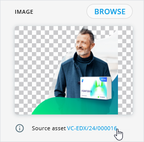
Also, you can upload an asset to the selected component or replace the existing one. For this, click BROWSE and select the required asset from Library, Veeva Vault, or your device.
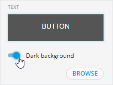
For the button, calendar, card, event, and tab group components, you can improve the visibility of light text in the text input area with the Dark background toggle.
See how to customize the properties for specific components in the Components section.
Contact your administrator to configure the display of the source asset in component properties.
Element type
On the Properties tab, you can assign the element type to the title, text, image, video, and button added to the content item layout or block. For this, select the component on the layout and choose the required value from the ELEMENT TYPE list.
Contact your administrator to configure the element type list.
The component element type matches the asset classification specified in Veeva Vault PromoMats.
To arrange assets of a content module from Veeva Vault PromoMats within a block according to your design, assign the required element types to block components. For example:
| Element type | Component |
|---|---|
Headline | Title |
Summary | Text |
Photo | Image |
Video | Video |
As a result, the content module assets are inserted only into the components of a matching element type.
Assigning a new element type to a component within the content module pulled from Veeva Vault PromoMats affects the source content module after you republish this content module to Veeva Vault PromoMats.
Modules
The new element type approach for module text assets implies the following scenarios:
In eWizard Editor, you can change the element type of the module text asset. Then, publish the module with modified text assets to update the existing ones in Veeva Vault PromoMats. Only text assets with modified element types are updated within the module, while those without changes retain their original element type. Source text assets, separately from modules, remain unchanged.
When you pull the content module from Veeva Vault PromoMats into the content item, its text assets have the updated element types assigned during publication instead of the original ones.
Source asset link
Contact your administrator to configure the display of the source asset link.
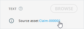
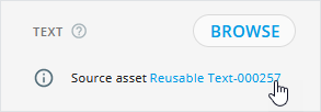
After pulling media and text assets from Veeva Vault PromoMats to Editor components, you can find links to the Veeva Vault source assets on the Properties tab.
To view the media asset, claim, and reusable text in Veeva Vault PromoMats, click the Source asset link on the component Properties tab. This feature provides quick access to the original asset in Veeva Vault PromoMats when you need to update it or check its metadata.
VVPM link to the source media asset:
VVPM link to the source claim:
VVPM link to the source reusable text:
Multicolor schemes
Available for emails, their briefs and fragments
Make sure the template supports the color scheme feature. Contact your administrator for details.
Color schemes allow you to quickly apply predefined brand-approved color combinations to email blocks and their components. This helps create visually balanced content faster while maintaining brand consistency and accessibility standards.
To set the default color scheme for the content item template:
In the Create new popup, select the required
Brandif several values are available.Select the required
Theme.If the selected template supports color schemes, the
Color schemedropdown appears below theThemefield.Select one of the predefined color schemes.
The list of available schemes varies depending on the selected theme. One scheme is preselected by default.
Click
CREATE.
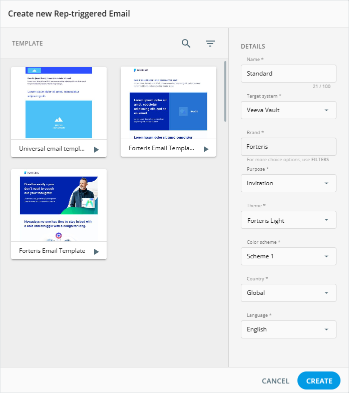
The selected color scheme becomes the template default and can't be changed later.
When you open the content item in Editor, default layout blocks automatically use the template color scheme. New blocks added from the Blocks tab also use it.
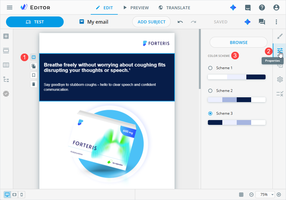
To change the color scheme for a specific block:
Select the required block on the layout.
Open the Properties tab.
In the
COLOR SCHEMEsection, select another scheme.
When a color scheme is applied to a block:
All unchanged components automatically update their colors.
New components added to the block automatically adapt to the block color scheme.
If you manually change a component style, such as text or background color:
The component becomes independent of the block color scheme.
Further color scheme changes no longer affect this component.
The component keeps its customized appearance even if moved to another block.
When you duplicate a block, the duplicate keeps the same color scheme. Moving a block doesn't change its color scheme. Components copied or moved individually become independent of block color schemes.
To revert a color scheme update for a block and its components, click Undo in Editor. The previous color scheme and component colors are restored.