Appearance
Start component development
After you initialize a component, you can develop your own custom component by modifying the files in the component directory.
According to the Vue.js guidelines, the component template must contain one root element.
For example, create a clicker button component on the slide in your demo e-Detailer. Add this code to the developed component instance in the root directory of the component.
js
// ./index.vue
<template>
<div class="clicker">
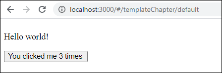
<p class="wiz-test-component">Hello world!</p>
<button v-on:click="count++">You clicked me {{ count }} times</button>
</div>
</template>
<script>
export default {
data: function() {
return {
count: 0
};
},
};
</script>You can run a development build with the wiz component build command. For more information, see wiz component build.
To view the result:
In your project directory, launch the demo e-Detailer.
shcd test-component/demo wiz dev --liveIn your browser, open the local host: http://localhost:3000
Click the button component that you've created to see how it increments by 1 with every click.
Usage
As best practice, use eWizard Editor to add and edit the components.
Add the component as a tag to an e-Detailer slide, email, or a site page. Add the tag within the <template> tag of the Vue file:
For an e-Detailer slide:
./slides/default/index.vuewheredefaultis the ID of the slide.For an email and a landing page:
./App.vueFor a page in a multipage site:
./pages/default/index.vuewheredefaultis the page ID.
For example, <wiz-custom-component>:
html
<!--./slides/default/index.vue OR ./App.vue OR ./pages/default/index.vue -->

<template>
    <wiz-slide class="editable-block">
        <wiz-text :text="$t('text')"></wiz-text>
        <wiz-custom-component id="test-component-3710" class="default"></wiz-custom-component>
    </wiz-slide>
</template>