Appearance
Grid-based layouts
Grid-based layouts provide a structured approach to organizing content consistently across different channels. They help maintain visual balance, improve readability, and make designs easier to adapt to various screen sizes and formats. By aligning elements within a grid, you can ensure predictable layouts, reduce design inconsistencies, and streamline content updates.
In the eWizard.js framework, grid-based layouts are implemented through the wiz-grid and wiz-grid-area components, which allow you to:
Relatively arrange content in a grid structure.
Adjust the layout based on the selected content item type.
Control the placement and proportions of elements.
Basic grid structure
Each grid-based layout consists of a wiz-grid parent component and one or several wiz-grid-area child components. You must place all other components only within the wiz-grid-area components.
Each grid area must contain its name in the area-name property in the alpha-numeric format. This name is used to arrange grid areas on the content item layout.
html
<wiz-grid>
  <wiz-grid-area area-name="a"></wiz-grid-area>
  <wiz-grid-area area-name="b"></wiz-grid-area>
</wiz-grid>
Areas & columns
To arrange grid areas on the content item layout, the eWizard.js framework offers two main properties:
areas
columns
The areas property defines the grid structure for placing wiz-grid-area components as a matrix. It's specified as an object where each key represents the channel name (e-Detailer, email), and each value is an array of string arrays, where each value matches a grid-area position.
The column property defines the width of grid columns.
html
<wiz-grid
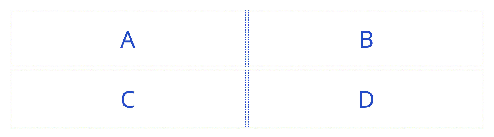
:areas="{ edetailer: [['a', 'b'], ['c', 'd']] }"
:columns="{ edetailer: ['50%', '50%'] }"
>
<wiz-grid-area area-name="a">A</wiz-grid-area>
<wiz-grid-area area-name="b">B</wiz-grid-area>
<wiz-grid-area area-name="c">C</wiz-grid-area>
<wiz-grid-area area-name="d">D</wiz-grid-area>
</wiz-grid>In the browser, this example grid structure looks as follows:
Rendering
For proper component rendering in browsers, email clients, target systems and devices, wiz-grid generates CSS grid layouts (for e-Detailers) and table layouts (for emails).
The example given above renders as follows.
CSS grid layout (e-Detailer):
html
<div class="wiz-grid" style="display: grid; grid-template-columns: minmax(0px, 50%) minmax(0px, 50%); grid-template-areas: \"a b\" \"c d\";">
  <div class="wiz-grid-area" style="grid-area: a;">A</div>
  <div class="wiz-grid-area" style="grid-area: b;">B</div>
  <div class="wiz-grid-area" style="grid-area: c;">C</div>
  <div class="wiz-grid-area" style="grid-area: d;">D</div>
</div>
Table layout (email):
html
<table class="wiz-grid" style="width: 100%;">
  <tr>
    <td>
      <table class="grid-table break-columns" style="width: 100%;">
        <tr>
          <td style="vertical-align: top;">
            <table class="grid-table break-columns" style="width: 100%;">
              <tr>
                <td class="wiz-grid-area" style="width: 50%; vertical-align: top;">A</td>
                <td class="wiz-grid-area" style="width: 50%; vertical-align: top;">B</td>
              </tr>
            </table>
          </td>
        </tr>
        <tr>
          <td style="vertical-align: top;">
            <table class="grid-table break-columns" style="width: 100%;">
              <tr>
                <td class="wiz-grid-area" style="width: 50%; vertical-align: top;">C</td>
                <td class="wiz-grid-area" style="width: 50%; vertical-align: top;">D</td>
              </tr>
            </table>
          </td>
        </tr>
      </table>
    </td>
  </tr>
</table>
Rearrange columns in emails
In email layouts, mobile view defaults to a single column, but you can keep the desktop layout by configuring the rearrange-columns property. This property controls the automatic rearrangement of grid columns for the email mobile view as follows:
:rearrange-columns="true"—the layout defined in
wiz-gridproperties is automatically rebuilt into a single column.:rearrange-columns="false"—the layout defined in
wiz-gridproperties remains the same as in the desktop view.
Different layouts for different channels
You can arrange the same grid differently across channels. For this, in the areas and columns properties, specify the required layouts. This allows you to preserve the same Vue template with channel-specific layouts.
html
<wiz-grid
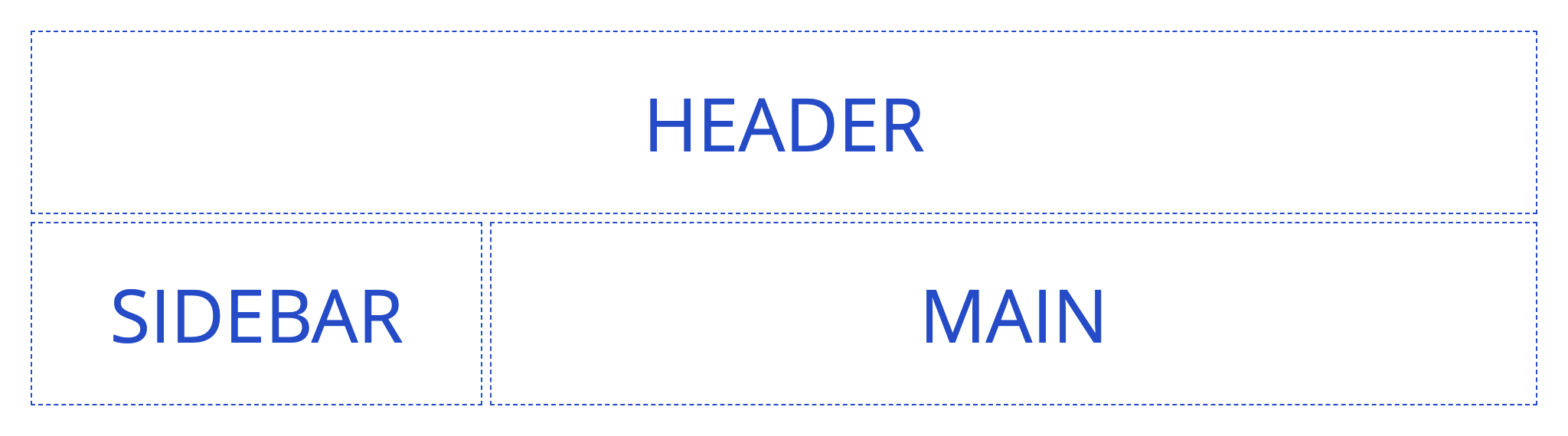
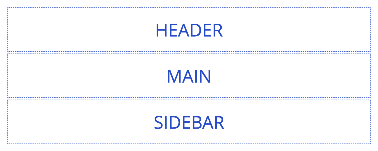
:areas="{
edetailer: [['header', 'header'], ['sidebar', 'content']],
email: [['header'], ['content'], ['sidebar']],
}"
:columns="{
edetailer: ['30%', '70%'],
email: ['100%'],
}"
>
<wiz-grid-area area-name="header">HEADER</wiz-grid-area>
<wiz-grid-area area-name="sidebar">SIDEBAR</wiz-grid-area>
<wiz-grid-area area-name="content">MAIN</wiz-grid-area>
</wiz-grid>In e-Detailers, this example looks and renders as follows:
html
<div class="wiz-grid"
  style="display: grid; grid-template-columns: minmax(0px, 30%) minmax(0px, 70%); grid-template-areas: \"header header\" \"sidebar content\";">
  <div class="wiz-grid-area" style="grid-area: header;">HEADER</div>
  <div class="wiz-grid-area" style="grid-area: sidebar;">SIDEBAR</div>
  <div class="wiz-grid-area" style="grid-area: content;">MAIN</div>
</div>
In emails, this example looks and renders as follows:
html
<table class="wiz-grid" style="width: 100%;">
  <tr>
    <td>
      <table class="grid-table break-columns" style="width: 100%;">
        <tr>
          <td class="wiz-grid-area" style="width: 100%; vertical-align: top;">HEADER</td>
        </tr>
        <tr>
          <td class="wiz-grid-area" style="width: 100%; vertical-align: top;">MAIN</td>
        </tr>
        <tr>
          <td class="wiz-grid-area" style="width: 100%; vertical-align: top;">SIDEBAR</td>
        </tr>
      </table>
    </td>
  </tr>
</table>
Limitations
When working with wiz-grid, keep the following limitations in mind:
Obligatory child element:
wiz-grid-areamust always be a direct child ofwiz-grid.Allowed components: You can place any component inside
wiz-grid-area, except anotherwiz-grid-area.No empty spaces: The grid must be fully populated. For example, if columns define 4 columns, each row in grid areas must also contain 4 columns.
Content-determined height: You can add as many rows as needed, but row height is determined by the height of the content placed in the grid area and padding within each
wiz-grid-area.Gaps between areas: To ensure a clean and predictable layout, we recommend using consistent horizontal and vertical paddings across all areas instead of standard CSS grid gaps.