Appearance
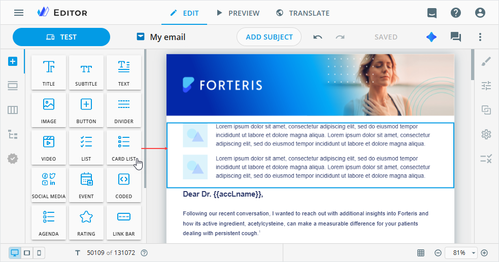
Card list
CARD LIST allows you to arrange information in a specific order and illustrate it with images. You can also add links for interaction with the entries in the card list component. As a result, the user can click an entry to get more information or perform an action.
To add this component to your email, drag CARD LIST from the Components tab on the elements panel to the email layout.
To customize the card list component, select it on the email layout and go to its Properties tab.
Here, you can configure the card list component in the following way:
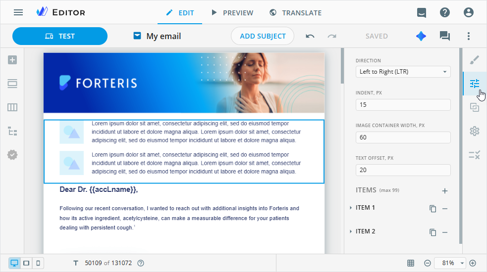
Choose whether the image appears to the left or right of the text.
Change the text line indent in pixels.
Set the image container width in pixels.
Indent the text from the image container in pixels.
Add up to 99 items to the card list component.
In the ITEMS section, you can use the following controls to manage the items:
| Control | Action |
|---|---|
 | Unfold the item to customize its values. |
 | Duplicate the required item with its properties. The duplicated item is added after the original one. |
 | Delete the existing item. |
Unfold the required ITEM section to do the following:
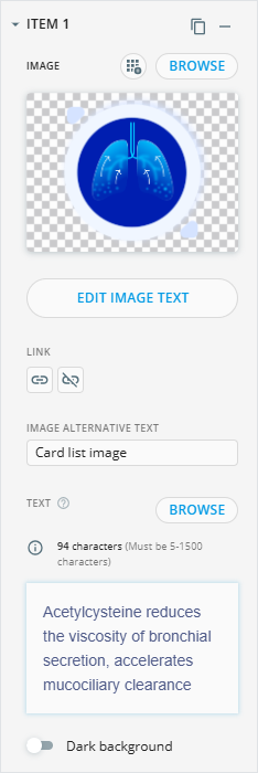
Save the added image to your Library with the
 button.
The file is stored in the size and format used in the content item type.
Its name is generated automatically. If the image metadata doesn't contain a human-readable name, the system generates one using the word "editor" and a unique ID.
Browse for a custom image in the Assets popup.
To modify the image in the
Edit imagepopup, hover over the image box and click .
.Add a link to the image.
Enter the image alternative text.
Add the text to the text line manually or upload it with the
BROWSEbutton.You can use the WYSIWYG editor for the text customization.
Improve the visibility of light-colored text in the text input area with the
Dark backgroundtoggle.Customize the required text lines on the layout with the inline editing. For this, double-click the card list component on the email layout.
You can also configure the styling of the card list component on the dedicated Editor tabs.