Appearance
Checkboxes
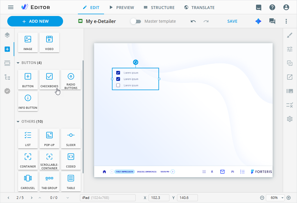
Use the interactive CHECKBOXES component to create a multiselect list of alternative options in your e-Detailers and websites.
To add this component to your e-Detailer, drag CHECKBOXES from the Components tab on the elements panel to the e-Detailer layout.
To customize the checkboxes component, select it on the layout and go to its Properties tab.
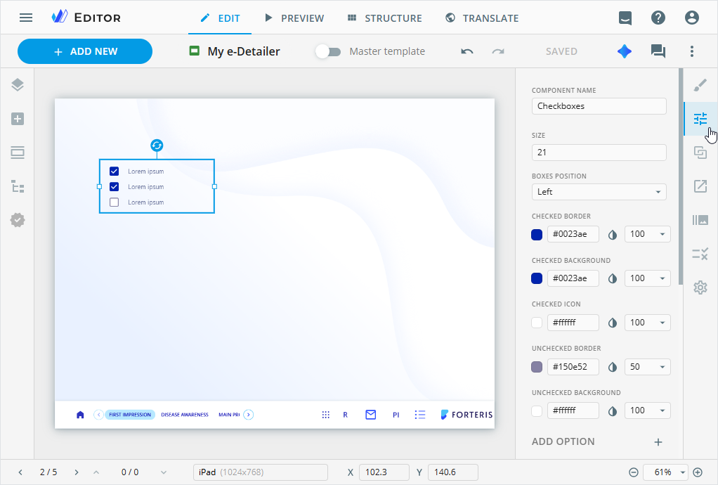
You can also select the component on the Tree tab.
On the Properties tab, you can configure the checkboxes component in the following way:
COMPONENT NAME: View and change the component name. It appears on the Tree tab of the elements panel in Editor.SIZE: Set the option box size in pixels with manual input or arrow keyboard keys.
BOXES POSITION: Select the option box position in relation to the text.CHECKED BORDER/BACKGROUND/ICON: Set the color of the checked box border, background, and icon.UNCHECKED BORDER/BACKGROUND: Set the color of the unchecked box border and background.
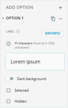
In the ADD OPTION section, you can use the following controls to manage the options:
| Control | Action |
|---|---|
 | Add a new option. |
 | Unfold the option to customize its values. |
 | Duplicate the required option. The duplicate is added after its source option. |
 | Select the box to display the option as checked on the layout. |
 | Select the box to not display the option on the layout. |
 | Delete the existing option. |
To add the required option value, do the following:
Go to the
LABELtext area.Enter the text or click
BROWSEto upload it.
You can also configure the component styling, add actions and animation to it on the dedicated Editor tabs.