Appearance
wiz-card-list
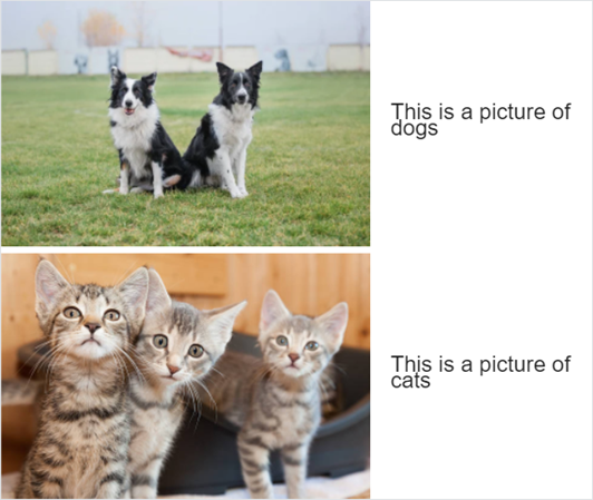
The wiz-card-list component is an HTML container with multiple cards. Each card comprises an image and text:
Learn more about components
Usage
To add the wiz-card-list component to the landing page template:
Add the
wiz-card-listcomponent in theApp.vuefile of your project.html<!--./App.vue --> <template> <wiz-root style="background: #ffffff; width: 880px;" class="editable-block"> <wiz-card-list id="wiz-card-list-547f" :items="[ { 'imageSrc':'./common/media/images/image1.jpg', 'imageAlt':$t('image1_alt_text'), 'text':$t('item1_text'), '__id':'2-items-1' }, { 'imageSrc':'./common/media/images/image2.jpg', 'imageAlt':$t('image2_alt_text'), 'text':$t('item2_text'), '__id':'2-items-2' } ]" :image-width="549" :top-image-offset="10" :item-indent="25" :text-offset="30" data-asset-id="aguvi2xb" ></wiz-card-list> </wiz-root> </template>The
idattribute is required for the correct display of the component styles in eWizard Editor.The
__idattribute is required for the correct display of the card styles in eWizard Editor.The
data-asset-idattribute is required for the Veeva Vault modules in theassets.jsonfile. For more information, see Veeva Vault publish settings.Add the card text and the image alternative text in the
<i18n></i18n>localization tag.html<!--./App.vue --> <i18n> { "eng": { "image1_alt_text": "A picture of dogs", "item1_text": "<p><span>This is a picture of dogs</span></p>", "image2_alt_text": "A picture of cats", "item2_text": "<p><span>This is a picture of cats</span></p>", } } </i18n>For more information, see Localization.
Attributes
You can change the wiz-card-list component appearance and behavior using the following attributes within the <wiz-card-list></wiz-card-list> tag.
itemsThe
itemsarray includes the list of cards represented by the{}objects. Each card is an object with properties. To change the properties of each card, edit its attributes.html<wiz-card-list :items="[ { 'imageSrc':'./common/media/images/image1.jpg', 'imageAlt':$t('image1_alt_text'), 'text':$t('item1_text'), '__id':'2-items-1' }, { 'imageSrc':'./common/media/images/image2.jpg', 'imageAlt':$t('image2_alt_text'), 'text':$t('item2_text'), '__id':'2-items-2' } ]" ></wiz-card-list>The
itemsattribute has the following properties:imageSrc—the path to the card image.imageAlt—the alternative text of the card image.text—the card text.
image-widthTo change the image width, set the value in pixels. Maximum value is
549.html<wiz-card-list :image-width="549"></wiz-card-list>top-image-offsetTo change the margin at the top of the card image, set the value in pixels.
The attribute corresponds to the Image top spacing property in eWizard Editor.
html<wiz-card-list :top-image-offset="10"></wiz-card-list>item-indentTo change the margin between the cards, set the value in pixels.
The attribute corresponds to the Entry spacing property in eWizard Editor.
html<wiz-card-list :item-indent="21"></wiz-card-list>text-offsetTo change the left margin of the card text, set the value in pixels.
The attribute corresponds to the Text indent property in eWizard Editor.
html<wiz-card-list :text-offset="14"></wiz-card-list>
Properties
The following properties are available:
| Property | Type | Default value | Description |
|---|---|---|---|
imageWidth | number | 60 | The width of the card image in pixels. Up to 549 px. |
itemIndent | number | 12 | Card indent in pixels. |
items | array | [...] | Item settings. Includes the properties of each item. |
textOffset | number | 24 | The left margin of the card text in pixels. |
topImageOffset | number | 24 | The top margin of the card image. |
item
The following properties are available:
| Property | Type | Default value | Description |
|---|---|---|---|
imageAlt | string | Add entry label | The text displayed on the layout if a card image fails to load. |
imageSrc | string | ./media/images/placeholder.svg | The path to the card image. |
text | string | <p style='line-height:24px;text-align:left;'><span style='font-size:12px;color:#212121; font-family:OpenSans,sans-serif;'>Add entry label</span></p> | The editable text displayed on the content item layout in eWizard Editor. |