Appearance
Working on Content
Before we start filling out emails with content we need to understand how they are built, so we have the possibility to create everything that we want.
eWizard CLI
- Install cli:
npm install -g ewizard-cli - Commands:
- Project initialization:
wiz init template-id project-name - Dev build:
wiz dev--watch- track file changes--live- track file changes and open local server
- Modies instal:
wiz install(wiz i).- Installing a specific component in a project:
wiz install component-name
- Installing a specific component in a project:
- Creating an archive for eWizard:
wiz archive
- Project initialization:
- Links:
App.vue
App.vue is the entry point of our component. This is our main file. Here we connect all our blocks and common styles. The main sections are the following.
File Structure
Typical App.vue file will be looking at something like this.
JAVASCRIPT
<i18n>
	{
		"en": {
			"title": "<div style='line-height: 34px;text-align: left'><span style='color:#000000;font-size: 29px;font-family:arial,\"helvetica neue\",helvetica,sans-serif;'><strong>Lorem ipsum dolor sit amet</strong></span></div>"
		}
	}
</i18n>

<template>
  <wiz-layout
    class="content-wrapper"
    style="border-spacing: 0; background: #ffffff; table-layout: auto"
    align="center"
  >
    <content-2a></content-2a>
  </wiz-layout>
</template>

<script>
  import image from "./public/default-image.jpg";
  import content2a from "./common/blocks-library/content-2a/index.vue";

export default {
  name: "v-app",
  components: { content2a },
  data() {
    return {
      image
    };
  }
};
</script>

<style>
@import "common/styles/main.css";
</style>
As you can see, the App.vue file consists of four main parts:
i18nlocalization - everything between<i18n></i18n>tag- component template - all content will be placed in
<template></template>after rendering - component functional - everything between
<script></script>tag - common styles - inside
<style></style>tag
Adding Content to an Email
In eWizard emails, we do not work directly with content. For ease of use, all content should be divided into reusable parts. This allows you to reuse it, if necessary, and develop it independently without affecting the structure of the email.
Possible basic elements are components. Usually, they are buttons, images, text areas, etc. Simple things that could be used without additional elements. Technically, everything in eWizard is a component.
Blocks are made up of components. Several components are combined with some common structure. For example, an article consists of a headline, an image, several paragraphs of text and social network icons.
Several blocks can be combined into a module - a unit that covers a large part of an email, sometimes a whole page.
| Email (App.vue) | Component
| :-------------------------------------------------------: | :-------------------------------------------------------: | :-------------------------------------------------------: | :-------------------------------------------------------: | |  |
|  |
|
| Block | Module |
|---|---|
 |  |
Using Blocks and Components
While developing an email template you can also use predefined parts of the email. They are divided into two types:
- blocks
- components
Blocks
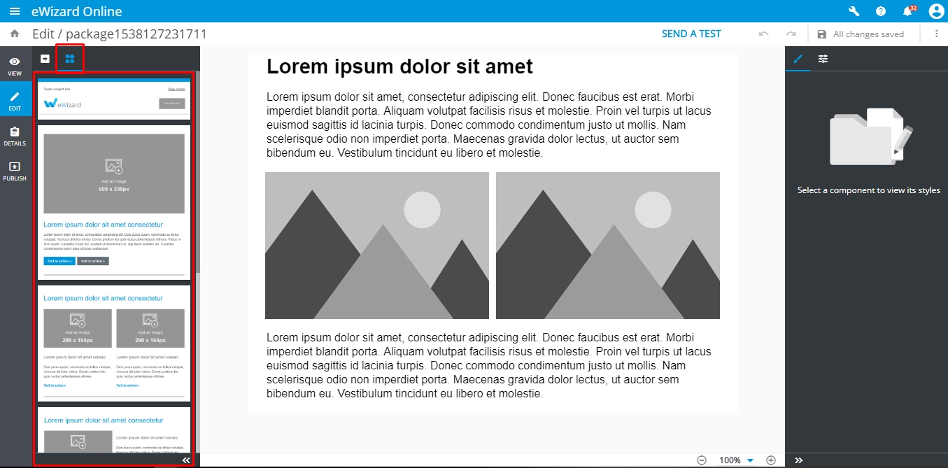
The block element stands for the ready to use piece of email template markup with predefined content and design. Users can add a block to the email template and edit it in the eWizard editor. The concept of blocks intends that users can quickly construct an email from the set of predefined elements with determined layout and edit them using visual editor without having the issues with <table> markup and styling.
For now, all the blocks of the email template are defined and stored in the email template source files as Vue components.
Blocks Library
By default, the initialized email template project (created by wiz init command) already has the set of simple blocks which are configured and ready for use in the eWizard editor.
All these blocks are taken from the common/blocks-library/ directory and serve as templates. Once users added the block to the email template, the block component is copied from the blocks-library/ to blocks/ directory.
The blocks-library and blocks directories have the structure as below:
bash
.
└─common/
   ├─ blocks-library/ # contains the blocks templates that are available to add via eWizard editor
   |  ├─content-2m/ # the directory with block itself
   |  |  ├─public/ # contains media files to be used in the block
   |  |  | └─placeholder_290x290.jpg
   |  |  ├─index.vue # vue-component that describes block markup and design
   |  |  └─icon.png # screenshot of a block that is displayed in eWizard editor sidebar
   |  ...
   |  └─blocks.json # the manifest with metadata of all the blocks to display them in eWizard editor sidebar
   |
   └─ blocks/ # contains the blocks which are already added to the email template and can be edited in eWizard
      ├─content-2m-copy/ # block that can be imported to the slide and edited by user
      |  ├─public/
      |  ├─index.vue
      |  └─icon.png
      ...
To be able to view and to add a block in eWizard , the block should be registered in blocks.json file.