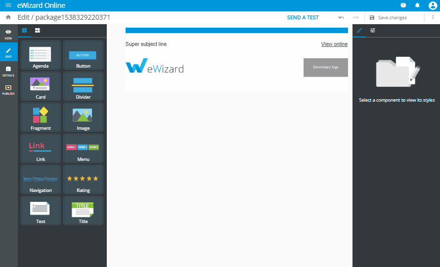
Appearance
The Modular Approach
Overview
The term “modularity” is widely used in technological and organizational spheres.
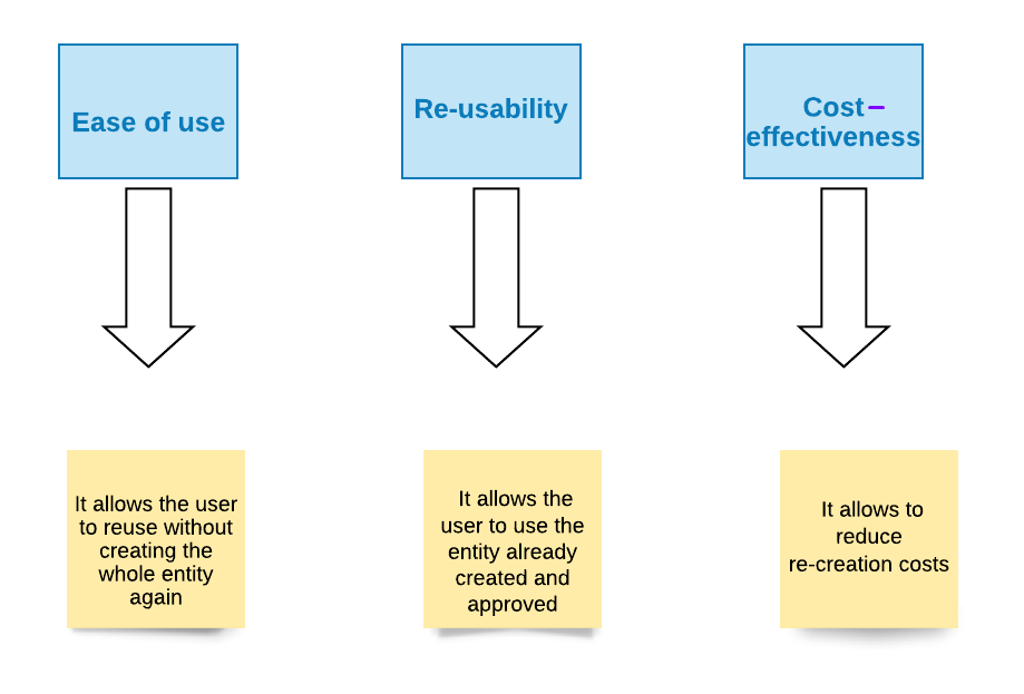
This approach enables to go through the processes of updating, localizing, approving and reviewing faster, much more productive and cost-effective. The modular approach is aimed at streamlining the editing and approval processes in the context of a multichannel approach with its "Edit/Approve once - publish to many".
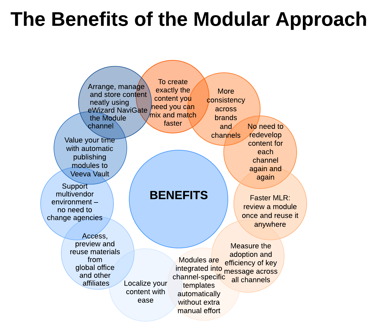
The introduction of a new approach has many advantages. See the main ones in the chart below.
Business rules
The use of modules is subordinate to several business rules.
Business rule 1 determines the degree of moduled editing. Our framework allows you to configure the ability to edit different components in different ways:
text editing
image editing
color editing
background editing
Business rule 2 determines the order of placement of blocks and modules in the template. A precise location method is approved.
Business rule 3 determines access to content for a user. Users can only see the content revealed to them. Also, the template's metadata influence on the available content.
Modular-type Content
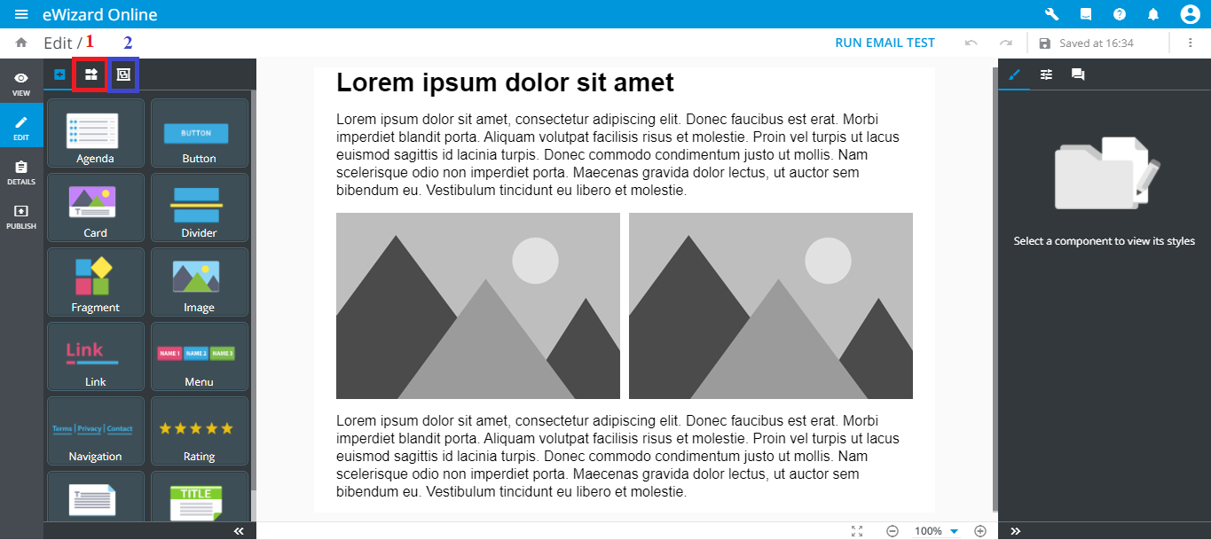
The eWizard platform introduces two types of entities (Blocks and Modules) within the modular approach. They provide the need to combine simpler components into one element with a more complex structure. You can find them in the items’ editing mode.
 A Block: A group of contentless components that are tied in one container [1].
 A Module: A group of contentful components that are approved [2].
The common and different characteristics of these entities are the following.
Blocks
The first modular component is a BLOCK.
A block is a contentless entity, in other words a structured blank. The block’s architecture is organized as follows: a set of several elements for which the necessary parameters are registered. Dummy text and images inside are further substituted by the relevant context.
The block structure is as follows:
[1] - Header [2a], [2b] – Body
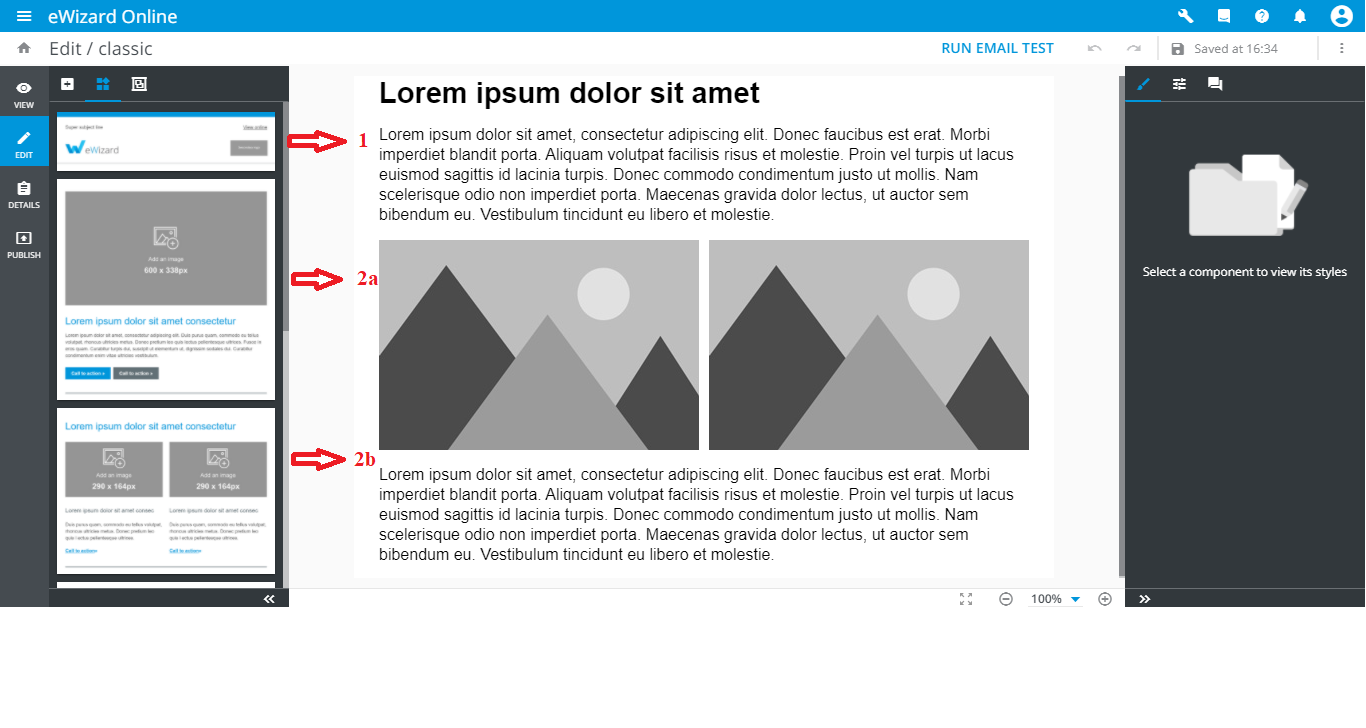
Blocks are generic. They allow users to enter a desired text and image, completely without any reference neither to the product, nor to the language, country, brand, etc. When using a template, all components of the block obey parameters of this template.
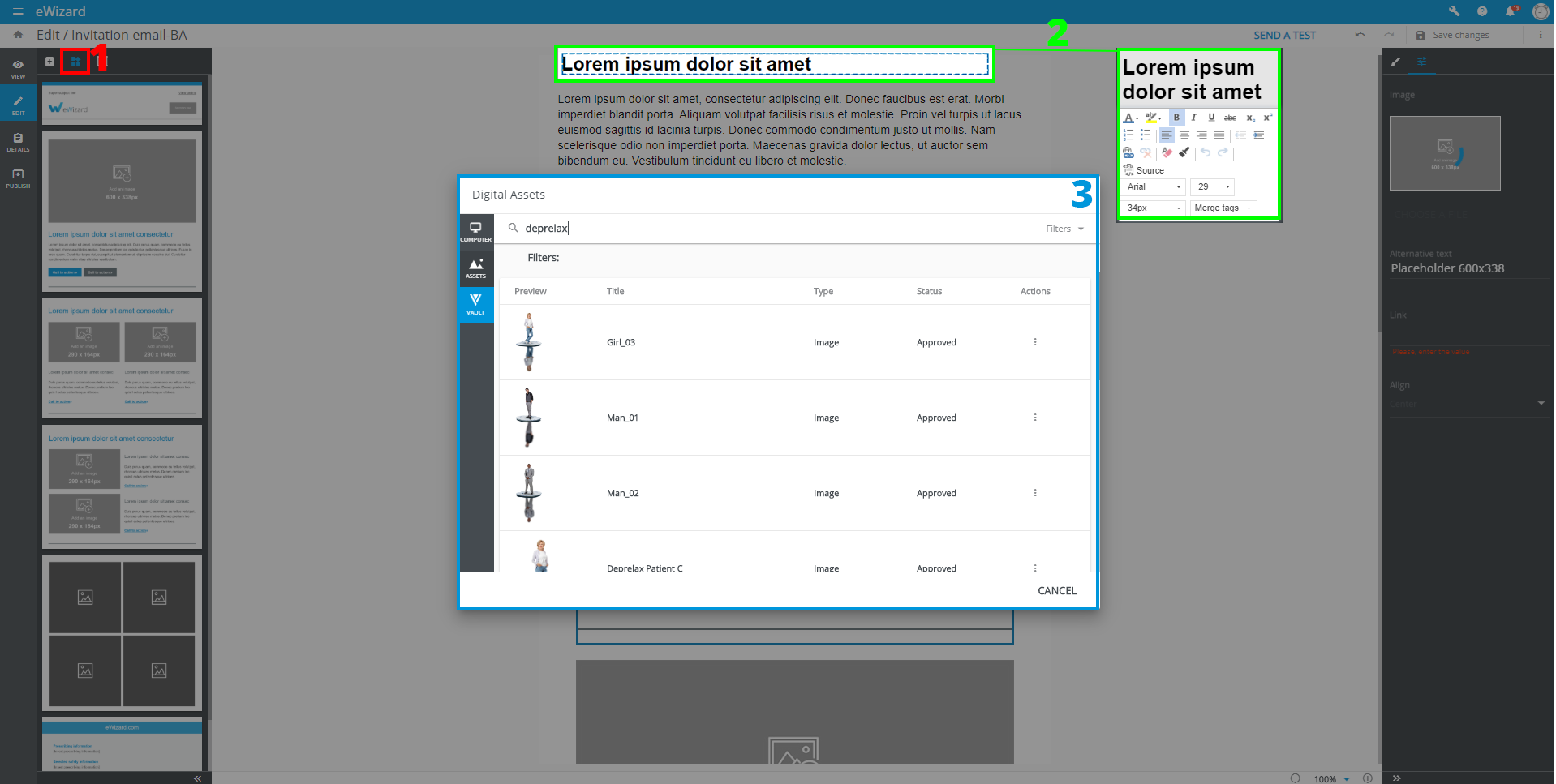
To manage blocks in Editor, you can click the drop-down list [1]. Here you can find all blocks related to the brand you are currently working on or choose all blocks available for you. You can fill them out with content. Blocks have higher dimensional modularity and degrees of freedom than modules:
• Text editing [2]. • Image editing [3].
Blocks have no distinct lifetime and exhibit flexibility. Blocks and modules are created in accordance with the brand book of the customer’s company. All components layout must be approved.
Modules
The second modular component is the MODULE.
The module is a contentful entity, a ready-made piece of content presented in the form of a ready-made block of the approved form.
The main distinguishing feature is branding as a method of providing the consistent experience for customers. The architecture of the module is the same as the block’s one, but all components are filled with the information previously agreed with the customer. The modules are assigned data to the product, language, country, etc. Ready-made modules can be used in e-Detailers, emails, microsites, call flows and surveys. They require minimal editing, so the modification function is disabled or can be implemented in the context of localization.
A module equates to a specific entity in Veeva Vault.
Email modules
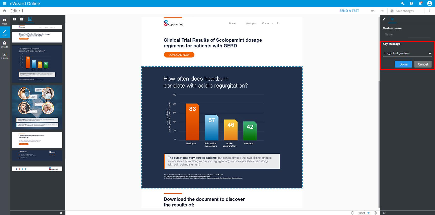
The Key Message Tracking feature is available for email modules. So, when you publish emails to Veeva Vault as PDF:
• You can assign a key message to each email's module. In Veeva, modules with key message IDs are published as individual entities; they are linked to the PDF published. As a part of the PDF published, modules and their key message IDs are displayed under the PDF's details Modules tab. The information about the modules used is in the Publishing summary, whereas two additional steps of modules creation in Veeva and linking them to the PDF are added.
• These key messages assigned to email's modules are saved for further publications. So that users can track the performance of each module.
• As a result, once published to Veeva as PDF, email modules are assigned with tracking IDs. These IDs are kept when publishing to SFMC as a newsletter. Further, tracking IDs are used for analytic purposes.
The Approval Process
At the core, modules must go through a full approval cycle.
Further, to create content, users can take only Approved modules. Modules approval takes place in two scenarios:
Any item with modules in its structure is sent for approval as a sole document.
A separate approval for each module as an entity by the criteria of the product, its testing, effectiveness, and the entire evidence base.
Benefits
Development
Block Development
Block Markup
The block itself is represented as a simple Vue component and described in index.vue file of its directory.
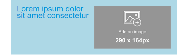
Let's try to create our first custom block component. To do so, create a directory my-block within common/blocks-library/ directory. The markup of the block should be added to the index.vue file within the template tag. So, we should create the index.vue file within my-block and add the preceding code:
html
<i18n>
  { "en": { "title": "
  <div style='line-height: 20px;text-align: left;'>
    <span style='color:#0096db;font-size: 29px'
      >Lorem ipsum dolor sit amet consectetur</span
    >
  </div>
  " } }
</i18n>

<template>
  <wiz-layout align="center" type="horizontal">
    <wiz-layout :css="{minHeight: '10px'}">
      <wiz-text :text="$t('title')"></wiz-text>
    </wiz-layout>
    <wiz-layout :css="{minHeight: '40px'}">
      <wiz-image :src="placeholderImage"></wiz-image>
    </wiz-layout>
  </wiz-layout>
</template>

<script>
  import placeholderImage from './public/default-image.jpg';

  export default {
    name: 'my-block',
    components: {},
    data: function() {
      return {
        placeholderImage
      };
    }
  };
</script>
The code above contains the block markup itself and the text data that is stored in the title of en object and passed to wiz-text.
All media resources and placeholderImage that is passed to wiz-image should be stored in my-block/public/ directory.
To see the result add the block commponent to email template markup, rebuild the project (by running wiz dev command) and open the ./index.html in a browser.
Block Styling
To style the block component add <style> tag into its index.vue file and define there css code to fit the block content your design. It is a common practice to make a stylesheet with commonly used css classes and reuse them while developing the custom blocks.
You can add inline CSS in the HTML tags if necessary.
html
<i18n>
  { "en": { "title": "
  <div style='line-height: 20px;text-align: left;'>
    <span style='color:#0096db;font-size: 29px'
      >Lorem ipsum dolor sit amet consectetur</span
    >
  </div>
  " } }
</i18n>

<template>
  <wiz-layout
    align="center"
    type="horizontal"
    class="my-block full-width border-collapse"
    :grid="layoutGrid"
  >
    <wiz-layout :css="{minHeight: '10px'}">
      <wiz-text :text="$t('title')"></wiz-text>
    </wiz-layout>
    <wiz-layout :css="{minHeight: '40px'}">
      <wiz-image
        :src="placeholderImage"
        style="padding-right:20px; padding-bottom:20px"
      ></wiz-image>
    </wiz-layout>
  </wiz-layout>
</template>

<script>
  import placeholderImage from './public/default-image.jpg';

  export default {
    name: 'my-block',
    components: {},
    data: function() {
      return {
        placeholderImage,
        layoutGrid: [
          { paddingTop: "20px", paddingLeft: "20px" },
          { paddingTop: "20px" }
        ]
      };
    }
  };
</script>
<style>
  .my-block {
    background-color: lightblue;
  }
  .border-collapse {
    border-collapse: collapse;
  }
</style>
Result:
To manipulate styles of the elements, the eWizard.js component wiz-layout has special props such as:
css- used to pass the styles inlined in the root element of thewiz-layoutcomponent;grid- used to pass inlined styles to table cells that wrap nested elements ofwiz-layout;
Refer to wiz-layout props to get acquainted with props syntax, format and explanation.
Block Metadata
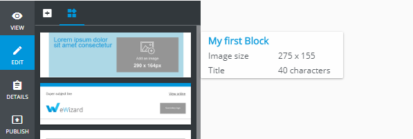
The eWizard editor takes out the information about the blocks from the blocks.json file in root of the blocks-library directory and adds all the blocks denoted in blocks.json to the sidebar.
Also, blocks.json contains meta-information with block content description. That information is showed in when a user hovers the mouse upon a block in the sidebar.
Each block from the blocks-library should be described as an object in the components array of the blocks.json file with the following structure:
json
"components": [
  {
    "id": "my-block", //the block component name from blocks-library/[block-name]/index.vue file
    "name": "My first Block", //stands for the block name in eWizard sidebar
    "model": {},
    "icon": "common/blocks-library/my-block/icon.png", // path to the block icon which will be displayed in sidebar
    "metadata": [ // the metadata to be displayed in tooltip
      {
        "id": "image_size",
        "label": "Image size",
        "value": "275 x 155"
      },
      {
        "id": "title",
        "label": "Title",
        "value": "40 characters"
      },
    ]
  }
]
Each object in metadata is rendered as a new string with helpful information, that appears when the user moves the mouse pointer over a block in the sidebar. That information may help the user understand which type of content block exists and find out the content description and properties.
As a result, the following sidebar tooltip of my-block may appear:
Adding block to email template
If you are going to add any block from the block library to email template markup, just copy directory with a block to the common/blocks/ directory.
Then add the tag which corresponds block component name to email template markup:
html
<template>
  <div align="center">
    <wiz-layout
      class="content-wrapper"
      style="border-spacing: 0; background: #ffffff; table-layout: auto"
      align="center"
    >
      <my-block></my-block>
    </wiz-layout>
  </div>
</template>

<script>
  export default {
    name: "v-app",
    components: {},
    data() {
      return {};
    }
  };
</script>

<style>
  @import "common/styles/main.css";
</style>
To check the results run wiz dev command in the root of the email template directory and open the ./index.html file in any browser.
Adding Blocks in the eWizard Editor
To add new blocks to an email, switch left sidebar to the Blocks tab and drag the block to a required position in the email.
The eWizard editor automatically adds the block from the block-library to common/blocks/ directory with a new name. Any changes applied to the block content are stored in thecommon/blocks/[block-name]/index.vue file of the email.
Component Development
Because this is not a presentation and a component can't be interactive, it is better to use already existing components that were developed by our teams. However, if you want to you can create your components.
Component directory structure
bash
.
└─
  └─.ewizard
  |  └─ settings.json #contains the project settings and plugins configuration
  ├─ package.json # npm manifest
  ├─ index.vue # component code should be here
  ├─ demo/ # demo presentation directory
  └─ media/ # media directory
    ├─ images/
    ├─ video/
    └─ fonts/
Component Development Guidelines
- Follow official Vue guidelines
- Add the
wiz-component-nameclass to the root element of the component - Define props according to the eWizard.js guidelines
Creating a component
Run wiz init command and pick the component from the given preset.
bash
$ wiz init
? Choose a template you want to use: (Use arrow keys)
  email
  e-Detailer
  survey
> component
Component Development process
Follow this process for component development.
==
Localization
As has been said all localization keeps in the index.vue file of the block.
JSON
<i18n>
  {
    "en": {
        "title": "Text sample",
  }
}
</i18n>
Tokens
What is a Token?
A token is a bit of a specific code that allows you to insert unique user data into emails. The most common example of this would be a tag like FNAME that allows you to insert the first name of the customer into an email.
Why are tokens used?
It is all about personalization! A reader is much more likely to open an email from you if you address them by the name. This helps grab their attention, and it also helps build a personal relationship with the reader.
Each mailing platform has its own tokens. For example, MailChimp:
- View Online:
*|ARCHIVE|* - Account First Name:
*|FNAME|* - Account Last Name:
*|LNAME|* - User Name:
*|LIST:NAME|* - User Email:
*|LIST:EMAIL|* - Unsubscribe:
*|UNSUB|* - Other tokens
Example of Usage
HTML
 Dear *|FNAME|* *|LNAME|*,
 <a href="*|UNSUB|*">Unsubscribe from this list</a>
Styles
When developing a letter, when we only create the structure of components we need, we can write styles as it is customary in Vue.js for a single-file components.

Dev build is based on modern technologies, so the development is simple and understandable for anyone familiar with modern CSS. But some email clients don't adapt so quickly to the new technologies.
They are stuck somewhere in the 90', so they do not understand separately connected styles and modern js frameworks. Therefore, all your components are rebuilt into a regular HTML document, and all styles are written inline with each element to which they are attached.
| Development build | Production build |
|---|---|
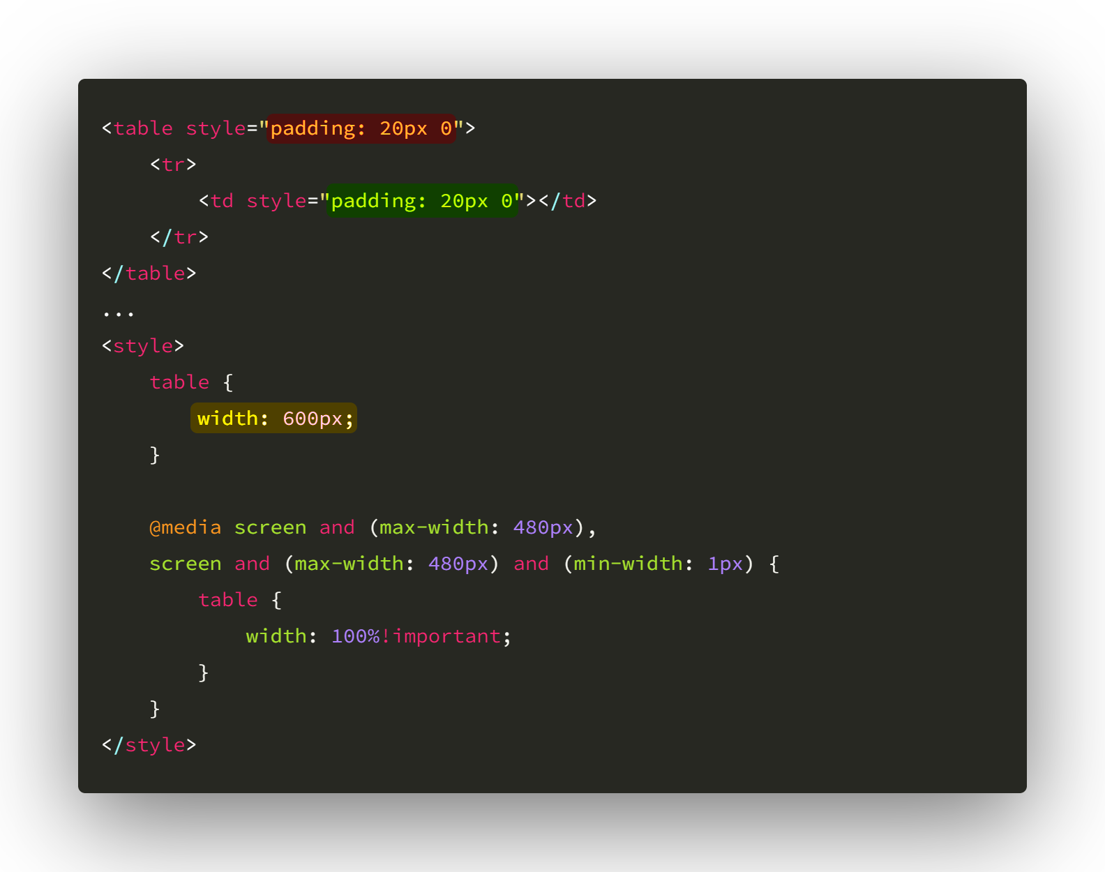 | 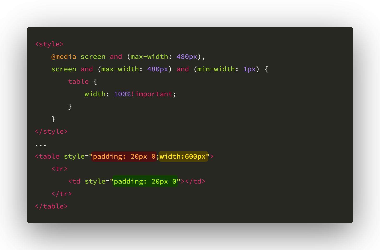 |
In the images, you can see that all the styles linked to the element (normally written or inline) are built as inline styles.
But the styles for mobile email clients are slightly different. Mobile email clients have been developed for the modern Internet with the latest technology in mind. They understand tags.
So we have to write them as media queries, but we have to add !important. This must be done in order to take priority over inline styles.
In production build all styles are moved to the top of the page, inside the <head> tag.
Columns
The template should be split into cells (wiz-column). The components should always be either in wiz-column or wiz-wrapper. If possible, the components should be grouped into one cell.

For Development Only
In this eWizard.js version if you want to see the results of your development you need to go to App.vue, import the block that you want to test and put its tags in the layout.
In production and higher versions eWizard.js, handles iе.
Conclusions
Thereby, the modular approach means standardizing the content creation process since modularity is impossible without some level of standardization. This will greatly make content generation and localization way faster.