Appearance
Email editing configuration
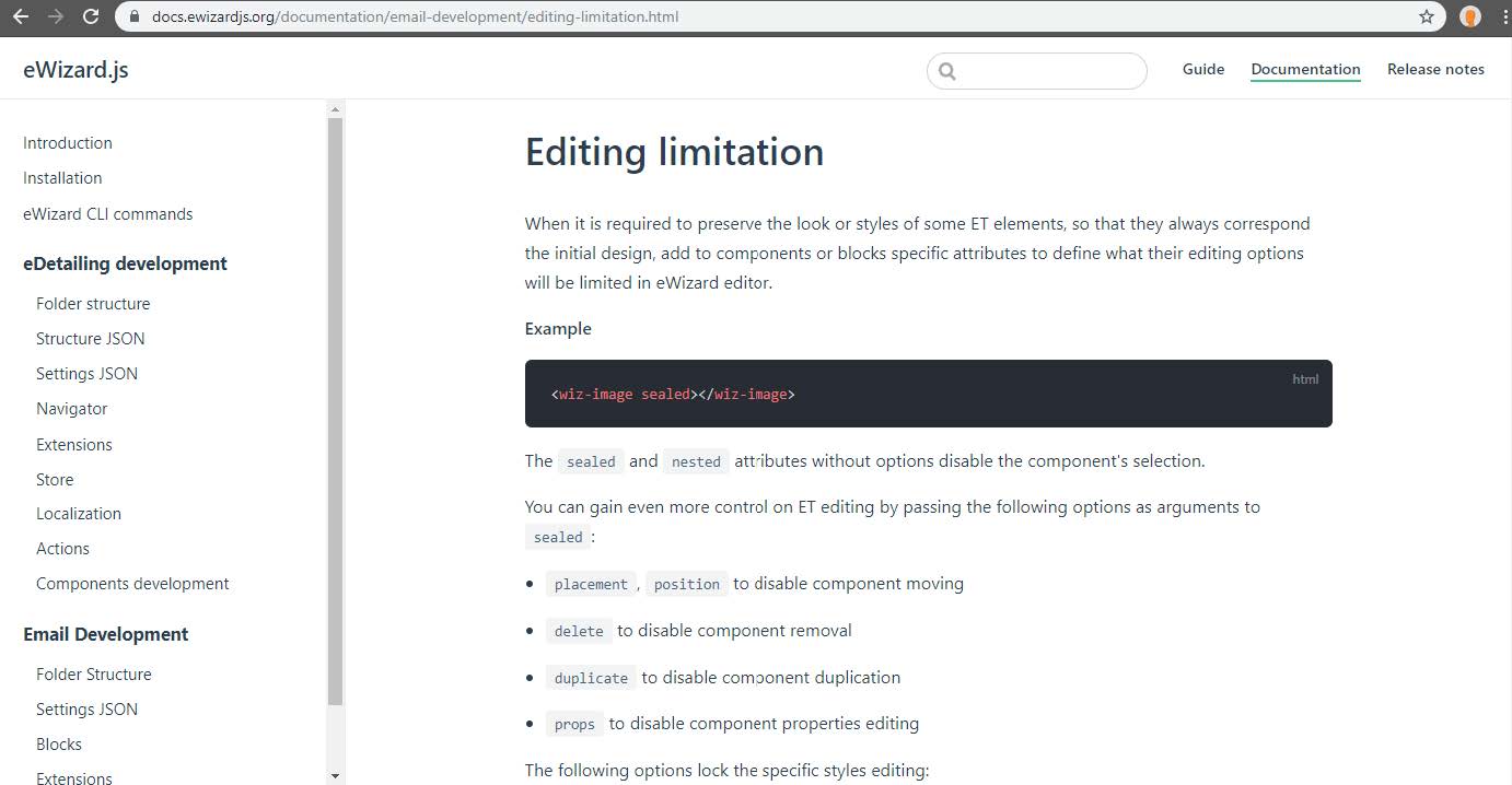
Sometimes there is a need to restrict editing capabilities for some components or blocks in the email. Such possibility is especially useful while developing an Email Template that will be used as a Master Template and will be used by a lot users. You can restrict editing possibilities for certain elements to preserve initial design of ET so it always correspond to design of Master version or your own technical requirements it. Also it is recommended to discuss with customers which elements should be locked for editing.
The sealed - is a special attribute for eWizard.js components which tells editor which editing capability should be locked for user. You will need to add this attribute directly to the tag of required component in ET markup.
Adding sealed attribute to the logo image in the header block:
- Open Email Template directory in any IDE you want and run the command in terminal wiz dev --watch to build project continuously upon any changes in its sources.
- Open the directory common/blocks/header-1d and open the index.vue file which represents the block markup;
- Add the sealed attribute to wiz-image which displays the primaryLogo.
html
        <wiz-layout content-align="left" :css="{minHeight: '10px'}">
            <wiz-image
                sealed
                :src="primaryLogo"
                alt="Viseven"
                class="m-full-width m-p-t-15 m-center"
                align="left"
                :width="120"
                style="padding: 9px 0px 20px;width: 122px; height: 49px">
            </wiz-image>
        </wiz-layout>
Add the sealed attribute to the wiz-text which displays header title and pass to this attribute a padding option
eWizard platform provides a wide editing capabilities for its components and bocks. To restrict a specific editing capability only, the sealed attribute should be supplemented with appropriative options.
html
    <wiz-layout content-align="left" class="border-collapse m-center" :css="{minHeight: '10px'}" >

        <wiz-text sealed="padding" class="m-fs-22" :text="$t('tilte')" style="padding: 10px 0px 2px 5px;"></wiz-text>

        <wiz-text :text="$t('subtitle')" style="padding: 3px 0px 5px 5px;"></wiz-text>
    </wiz-layout>
In this case, user will not be able to change components padding, because the whole section with padding editing will be disabled. However, all other editing capabilities should be available as usual.
You can pass multiple options to sealed attribute by separating them with a whitespace and disable several editing capabilities at the same time. For example let's add more options to sealed attribute of primaryLogo image.
html
<wiz-image sealed="padding delete border size padding" :src="primaryLogo" alt="Viseven" … >The sealed attribute supports a bunch of different options which you may find useful during the development, you can find detailed documentation about each option in the official ewizard.js documentation site.
Finally, to see how the email editing restriction works in action archive there is need to archive email project and upload it to eWizard. You can archive the project sources by running wiz archive command.
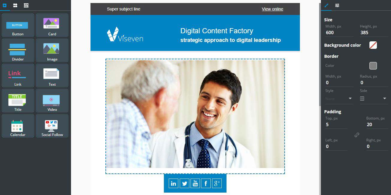
As result it is not possible to select the Xarelto logo in email. Also editing of padding, border, size is forbidden for the Bayer logo in header.

Custom component development
Let’s create a simple component which will be called wiz-text-image. It will have pretty straightforward functionality - display an image with some text. The image and text should be available for editing in eWizard.
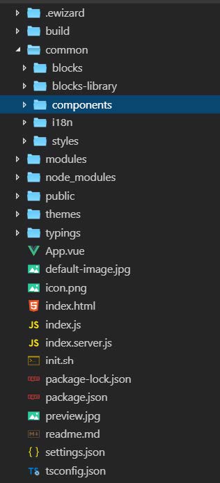
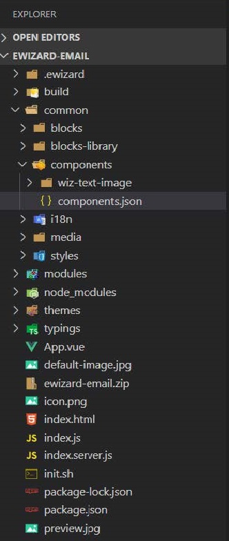
While developing a large project, you can store your custom components separately from ET sources to reuse them in other projects. However, you can store our custom component in the components directory of ET.
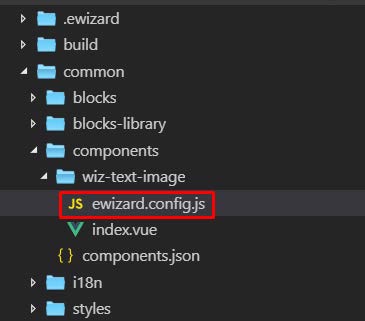
- Create a new directory within components directory and name it wiz-text-image.
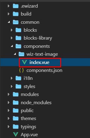
- Create a index.vue file inside wiz-text-image directory
The next step is adding basic tags - template, script, and styles, according to Vue.js guidelines.
Inside the script tag, should be exported an object which represents a component instance.
html
    <template></template>

    <script>
    export default {

    }
    </script>

    <style scoped></style>
Define a name field and include the ewizardConfig object which should be imported from ewizard.config.js file
html
    <script>
    import ewizardConfig from "./ewizard.config.js"

    export default {
        name:"wiz-text-image",
        ewizardConfig,
        props:{}
    </script>
Create ewizard.config.js file in the wiz-text-image directory. The file should export an object with a props object:
It is mandatory to create a config file and mixin it with a component instance, as this file will be used for storing component props localization and component types designed specifically for eWizard. The localization of props and additional types will be covered later
Write this code in ewizard.config.js:
JS
    export default {
        props:()
    }
All eWizard.js components have their names as the class name assigned to the root element.
Such an approach gives us a possibility to further define common styles for all component instances in Email styles.
Note that each component can be used in ET multiple times. It is not recommended to use the id in the template to avoid producing invalid markup and conflicts of styles.
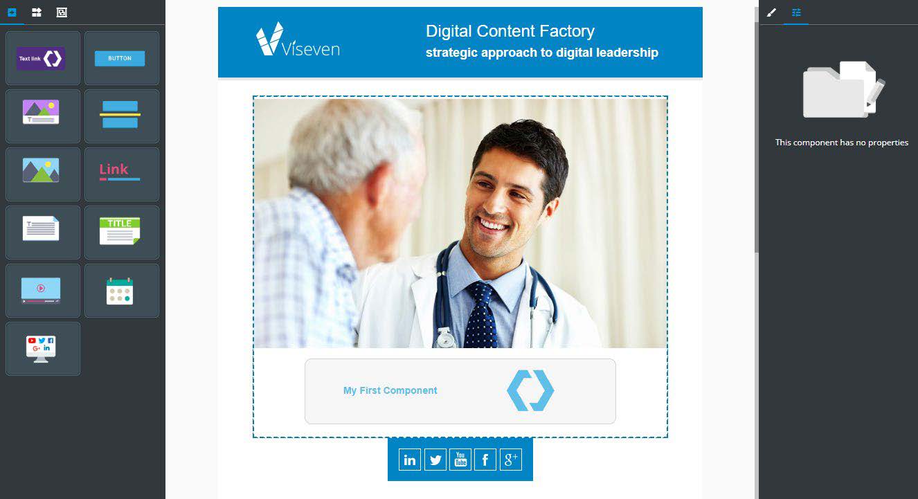
Add a table element with a class name wiz-text-image and simple text within table cell
html
    <template>
        <table class="wiz-text-image">
            <tr>
                <th>
                    My first component
                </th>
            </tr>
        </table>
    </template>

    <script>
    import ewizardConfig from "./ewizard.config.js"
    export default {
        name:"wiz-text-image",
        ewizardConfig,
        props:{}
    }
    </script>
We have created a simple blank component. To see how it looks we need to register a component in ET and add its tag somewhere in markup where it should be used
Open the index.js file and import wiz-text-image component from the source files. Then register it as a global component.
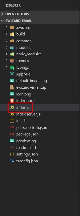
Content of index.js
JS
    //.......
    import VisevenTheme from './themes/Viseven'

    import wizTextImage from './common/components/wiz-text-image/index.vue'

    ......

    Vue.component('wiz-fragment', wizFragment);

    Vue.component('wiz-text-image', wizTextImage);
Now, we can use that component everywhere in ET markup or within the blocks.
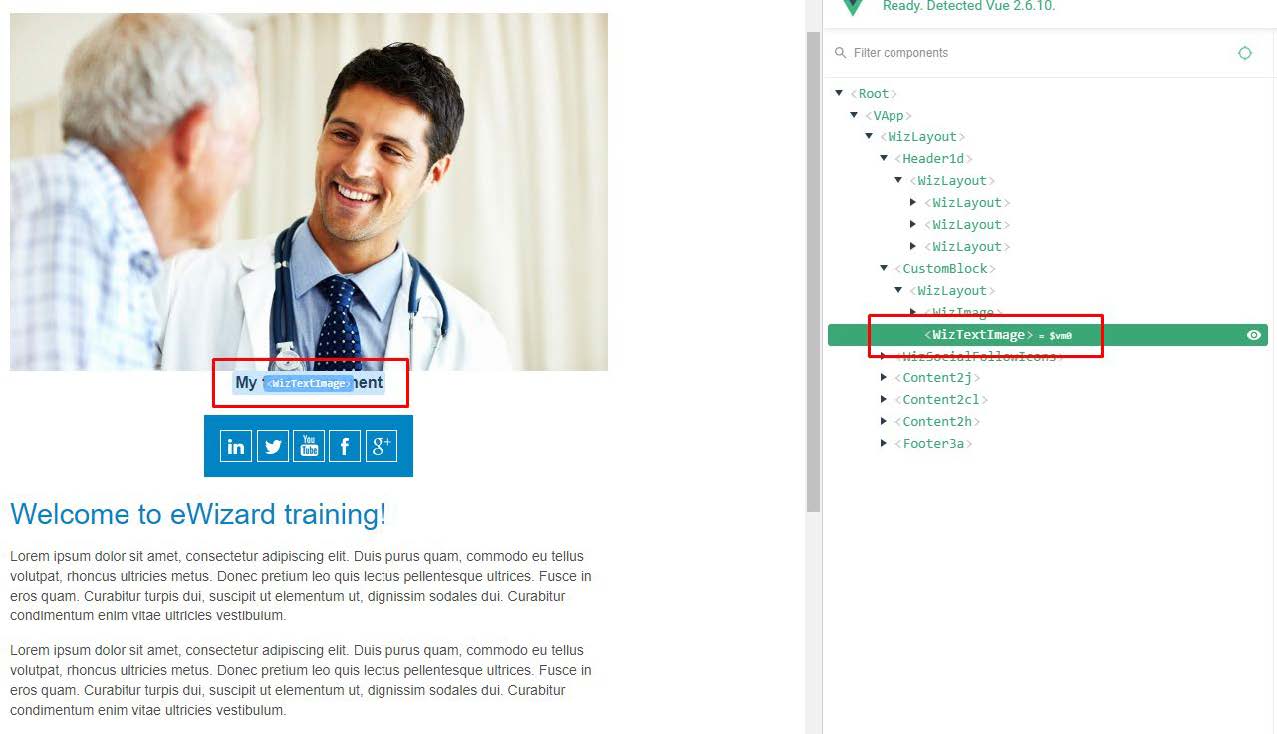
All Email content should be divided into the blocks. So, add a wiz-text-image component to the our custom block which is already used in Email.
Open the directory blocks find here a custom-block directory and add wiz-text-image tag to its markup in the index.vue file:
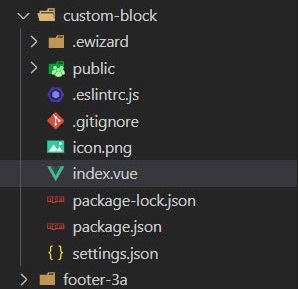
Content of index.vue
html
    <template>
        <table cellspacing="0" style="width: 600px; padding: 5px 0px 20px 0px;">
            <tr>
                <td align="center">
                    <wiz-image :src="image" class="default-content-item"></wiz-image>
                    <wiz-text-image></wiz-text-image>
                </td>
            </tr>
        </table>
    </template>
In you have not started wiz dev --watch command previously. Rebuild email project using wiz dev command and open the index.html file in a browser
Within a components you can use standard HTML elements and already installed email components. When creating a component as separate project it is recommended to install all subcomponents as NPM packages and register them in component instance. However our custom component is being developed along with ET project, so we can omit that step and use any subcomponents without additional installation.
html
    <template>
        <table class="wiz-text-image">
            <tr>
                <th>
                    <wiz-text></wiz-text>
                </th>
                <th>
                    <wiz-image></wiz-image>
                </th>
            </tr>
        </table>
    </template>
To configure our components, define a captionText field with some text in the component’ data.
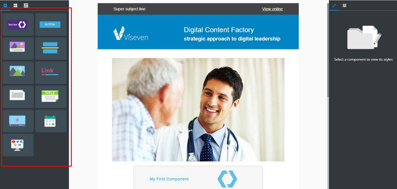
E.g let’s add the text “My First Component” and bind captionText to the text property of wiz-text component.
html
    <template>
        <table class="wiz-text-image">
            <tr>
                <th>
                    <wiz-text:text="captionText"></wiz-text>
                </th>
                <th>
                    <wiz-image></wiz-image>
                </th>
            </tr>
        </table>
    </template>

    <script>
        import ewizardConfig from"./ewizard.config.js";

        export default{
            name:"wiz-text-image",
            ewizardConfig,
            props:{},
            data(){
                return{
                    captionText: "MyFirstComponent"
                }
            }
        };
    </script>
After that, import the image file and add it to the custom component’s data.
To configure the second component with predefined content we need some image file. Put the image file to the public directory of wiz-text-image component
Now, you can bind image from a data to src prop of wiz-image. This property defines the image source:
html
    <template>
        <table class="wiz-text-image">
            <tr>
                <th>
                    <wiz-text:text="captionText"></wiz-text>
                </th>
                <th>
                    <wiz-image:src="defaultImage"></wiz-image>
                </th>
            </tr>
        </table>
    </template>

    <script>
        import defaultImage from“./public/default-image.jpg"
        import ewizardConfig from "./ewizard.config.js"
        export default{
            name:"wiz-text-image",
            ewizardConfig,
            props:{},
            data(){
                return{
                    captionText:"MyFirstComponent",
                    defaultImage
                }
            }
        };
    </script>
Component properties
To make the component actually useful and reusable, there is a need to allow its configuration and customization for the user. Properties are used for these purposes. Vue.js engine allows defining properties in several ways. In eWizard.js framework we are using object notation for properties and defining all properties in props object. When the user selects a component in eWizard, all its properties are available for editing in the properties tab. Now, we are going to make editable the text element of our component (wiz-text-image).
Add a title property into the props object with a default value 'My first component!' and set its type as a String. Delete captionText property from data object. Then bind a title to the text property of wiz-text.
html
    <script>
        import defaultImage from “./public/default-image.jpg"
        import ewizardConfig from"./ewizard.config.js";
        export default{
            name:"wiz-text-image",
            ewizardConfig,
            props:{
                title:{
                    type:String,
                    default:"MyFirstComponent"
                }
            },
            data(){
                return{
                    defaultImage
                }
            }
        };
    </script>

    <template>
        <table class="wiz-text-image">
            <tr>
                <th>
                    <wiz-text:text="title"></wiz-text>
                </th>
                <th>
                    <wiz-image:src="defaultImage"></wiz-image>
                </th>
            </tr>
        </table>
    </template>
Vue.js provides a bunch of type checks for properties validations which you can define in the type field. However, eWizard.jsDevelopment team has extended the default types with our custom types compatible with eWizardeditor.
To specify the property type for eWizardwe can use the additional fields actualType and subtype. eWizard editor displays each actualType in an appropriative view. E.g for Text actualType will be displayed in the WYSIWYG area, for actualType URL will be displayed the input to enter the link.
To simplify development, we have gathered all possible values of actualType and subtype as constants within component-types package. Its description and documentation about installation is available at eWizardjs documentation site.
The component types package is already installed in training template. Thus you can import the PropType, FileType objects from the package and use PropType.Text,as actual type of the title property. Write this in wiz-text-image component index.vue file:
html
    <script>
        import { PropType, FileType } from "component-types";
        import defaultImage from "@/public/default-image.jpg"
        import ewizardConfig from "./ewizard.config.js";
        export default{
            name:"wiz-text-image",
            ewizardConfig,
            props:{
                title:{
                    type:String,
                    actualType:PropType.Text,
                    default:"MyFirstComponent"
                }
            },
            data(){
                return{
                    defaultImage
                };
            }
        };
    </script>
The PropType.Text, will display title property as WYSIWYG editor while editing a component in eWizard.
Add one more property to be used for wiz-image configuration and allow you to choose an image from the Digital Assets or upload from the local files. For that purpose, we use actualType: PropType.File. Since eWizard Platform supports multiple media file types for uploading, that field should be supplied with subtype field. So, add a subtype FileType.Image to the component properties. And delete data object because we are no longer need it.
html
    <template>
        <table class="wiz-text-image">
            <tr>
                <th>
                    <wiz-text :text="title"></wiz-text>
                </th>
                <th>
                    <wiz-image :src="image"></wiz-image>
                </th>
            </tr>
        </table>
    </template>
JS
    ...
    export default{
        name:"wiz-text-image",
        ewizardConfig,
        props:{
            title:{
                type:String,
                actualType:PropType.Text,
                default:"MyFirstComponent"
            },
            image:{
                type:String,
                actualType:PropType.File,
                subtype: FileType.Image,
                default:defaultImage
            }
        },
    ...
To see the result of our enchantments and try props editing, rebuild ET by running a wiz dev command, archive the project via wiz archive and upload it to eWizard.
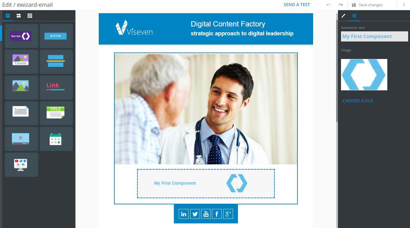
Click at the component and open the properties tab in right sidebar.
Now we can customize all components' properties: change a text and upload image file.
eWizard platform language can be customized according to the customers' needs. It is good practice to localize component properties, to make the process of editing of your component clear and improve user experience.
ewizard.config.js file is used for these purposes, where all localization properties stored in a props object. The ewizard.config.js should be mixed with a component instance in index.vue file. Also it is a good practice to move actualType and subtype fields to the ewizard.config.
Create label for your props items in the ewizard.config.js file.
Move actualType and subtype fields to the ewizard.config.js file
Content of ewizard.config.js
JS
    import { PropType, FileType } from "component-types"
        export default{
            props:{
                title:{
                    label:{
                        eng:"Awasome Text",
                        esp:"Texto impressionate"
                    },
                    actualType: PropType.Text,
                },
                image:{
                    label:{
                        eng:"Image",
                        esp:"Imagen"
                    },
                actualType:PropType.File,
                subType:FileType.Image,
                }
            }
        }
Content of wiz-text-image/index.vue
JS
    ...


    import eWizardConfig from './ewizard.config.js'
    import defaultImage from './public/default-image.png'

    export default {

        name:'wiz-text-image',
        eWizardConfig,
        props:{
            title:{
                type: String,
                actualType:PropType.Text,
                default:"My First Component"
            },
            image:{
                type:String,
                actualType: PropType.File,
                subtype: FileType.Image,
                default: defaultImage
            }
        },
    };
To localize a label that will be shown near the property, we use a label field. The label accepts an object in which every field corresponds to language abbreviations and contains a string with a localized label.
Add eng and esp localizations to the components labels. You can see how to do this in previous example.
Rebuild email using wiz dev command, archive it again via wiz archive and upload it into your eWizard account.
Now, when editing component properties we can see readable labels in the sidebar:

Component styles
Single file components approach of Vue.js components allows to define components styles in the same place where its markup and logic is described. To avoid style conflicts vue.js provides style scoping. That feature is very important and useful especially while developing ET. Since ET blocks and components are bundled into one file which renders whole markup of Email, it is highly recommended to use style scoping
Prettify the component by adding the following styles:
The text element should be styled using inline tags and styles. So that change default value of title property to the new one: To do so wrap the text in strong and span tags and define color in span.
CSS
    <styles coped>
        .wiz-text-image{
            margin-top:15px;
            padding:10px20px;
            background-color:#e7e7e7;
            border:1pxsolid#d4d4d4;
            border-radius:10px;
            max-width:450px;
            min-height:4px;
            color:#60bfe8;
        }
    </style>
JS
    export default{
        name:"wiz-text-image",
        ewizardConfig,
        props:{
            title:{
                type:String,
                default:"<strong><span style='#60bfe8;'>My First Component</span></strong>"
            },
            image:{
                type:String,
                default:defaultImage
            }
        },
    };
Rebuild email and open it in the browser. After our amends component have the following look:
While making responsive components which are displaying nicely in desktop and mobile clients is commonly use @media directive to detect a screen size and apply the responsive styles.
It is required to define styles for media queries in separated style tag which is not scoped. After exporting ET to production build those styles would be copied to HTML file with Email markup. As a best practice it is recommended to reset width for elements with fixed sizes to fit screen of mobile clients.
We are going to force displaying of a component’s content in a column ( the text in top andthe image in bottom):
CSS
<style>
@media screen and(max-width:480px) and (min-width:1px){
.wiz-text-image>tr>th{
display:block !important;
width:100%;
text-align:center;
}
}
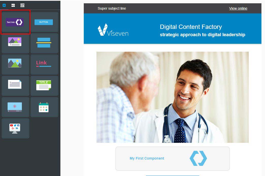
</style>The final step of component creation is configuration of the component for displaying in eWizard sidebar to make it possible to add new component instances to Email using drag & drop. All components that are available in the sidebar are listed in common/components/components.json file.
Content of components.json
JSON
    {
        "components": [
            {
                "id": "wiz-button",
                "name": "wiz-button",
                "model": {},
                "icon": "node_modules/wiz-button/icon.png"
            },
            {
                "id": "wiz-card",
                "name": "wiz-card",
                "model": {},
                "icon": "node_modules/wiz-card/icon.png"
            },
            {
                "id": "wiz-divider",
                "name": "wiz-divider",
                "model": {},
                "icon": "node_modules/wiz-divider/icon.png"
            },
            {
                "id": "wiz-image",
                "name": "wiz-image",
                "model": {},
                "icon": "node_modules/wiz-image/icon.png"
            },
    ...
id -the unique component id (should be used component tag name). eWizard-editor have the list of components id’s with localized names and displays appropriate name in sidebar.
name -the component tag name or object with components localization that will be displayed in eWizardsidebar in case if you are using custom localization (name localization will be covered further)
icon -path to the icon
All components that are available in sidebar have an icon. Thus it is a good idea to put icon image and define it path in components.json file.
To register a component add the following code snippet to components.json file:
JSON
    {
        "components":[
            {
                "id":"wiz-text-image",
                "name":“Wiz-Text-Image",
                "model":{},
                "icon":“./common/components/wiz-text-image/icon.png"
            },
        ...
    }
Rebuild the email and upload it to eWizardto see a result
Now we can add the component form the sidebar using drag & drop as usual.
You may notice that our component is a missing name in sidebar. This component is a custom one and eWizardeditor does not contain its id and a localization for its name. In this case you can contact with a support team to add your custom component name to eWizardconfigurations and your component name will be available in the next instance upgrade.
Another way to show the correct name -define localization for name directly in components.json file.So, let’s modify it in the following way:
JSON
    {
        "components":[
            {
                "id":"wiz-text-image",
                "name":{
                    "en":"Text with image"
                },
                "model":{},
                "icon":“./common/components/wiz-text-image/icon.png"
            },
Now the name object contains fields in which each field corresponds to localization name
Note that if you are going to use the custom localization of name, it will be required to define localization for each component’s object in components.json list:
Content of components.json
JSON
    {
        "components": [
            {
                "id": "wiz-text-image",
                "name": {
                    "en":"Text with image"
                },
                "model": {},
                "icon": "common/components/wiz-text-image"
            },
            {
                "id": "wiz-button",
                "name": {
                    "en":"Button"
                },
                "model": {},
                "icon": "node_modules/wiz-button/icon.png"
            },
            {
                "id": "wiz-card",
                "name": {
                    "en": "Card"
                },
                "model": {},
                "icon": "node_modules/wiz-card/icon.png"
            },
            {
                "id": "wiz-divider",
                "name": {
                    "en":"Divider"
                },
                "model": {},
                "icon": "node_modules/wiz-divider/icon.png"
            },
            {
                "id": "wiz-image",
                "name": {
                    "en":"Image"
                },
                "model": {},
                "icon": "node_modules/wiz-image/icon.png"
            },
    .......
If you have any questions do not hesitate to reach out to support@viseven.com
It is the end of tutorial. Now you know how to create block and component for the E-mail and how work with eWizard