Appearance
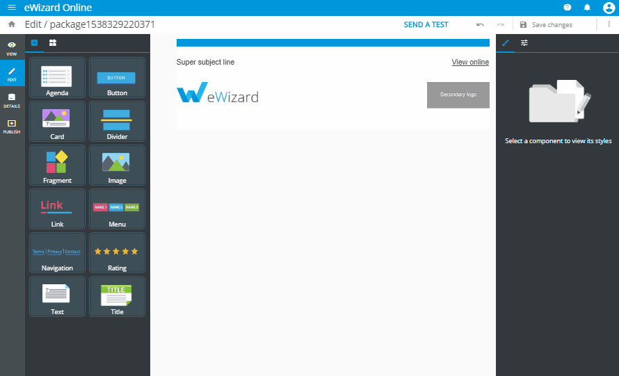
Blocks
Block element stands for the ready to use piece of email template (ET) markup with predefined content and design. User can add block to ET and edit it in eWizard editor. The concept of blocks intends that user can quickly construct email from the set of predefined elements with determined layout and edit them using visual editor without having the issues with <table> markup and styling.
For now, all the blocks of ET are defined and stored in ET source files as vue components.
Blocks library
By default, the initialized ET project (created by wiz init command) already has the set of simple blocks which are configured and ready for use in eWizard editor.
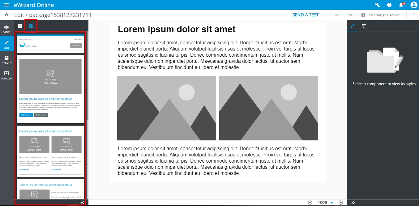
All these blocks are taken from the common/blocks-library/ directory and serve as templates. Once user added the block to ET, the block component is being copied from the blocks-library/ to blocks/ directory.
The blocks-library and blocks directories have the structure as below:
bash
.
└─common/
   ├─ blocks-library/ # contains the blocks templates that are available to add via eWizard editor
   |  ├─content-2m/ # the directory with block itself
   |  |  ├─public/ # contains media files to be used in the block
   |  |  | └─placeholder_290x290.jpg
   |  |  ├─index.vue # vue-component that describes block markup and design
   |  |  └─icon.png # screenshot of a block that is displayed in eWizard editor sidebar
   |  ...
   |  └─blocks.json # the manifest with metadata of all the blocks to display them in eWizard editor sidebar
   |
   └─ blocks/ # contains the blocks which are already added to the **ET** and can be edited in eWizard
      ├─content-2m-copy/ # block that can be imported to the slide and edited by user
      |  ├─public/
      |  ├─index.vue
      |  └─icon.png
      ...
To be able to view and to add a block in eWizard , the block should be registered in blocks.json file.
Block development
Block markup
The block itself is represented as a simple vue component and described in index.vue file of its directory.
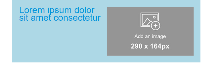
Let's try to create our first custom block component. To do so, create a directory my-block within common/blocks-library/ directory. The markup of the block should be added to index.vue file within template tag. So, we should create index.vue file within my-block and add the preceding code:
html
<i18n>
{
  "en": {
    "title": "<div style='line-height: 20px;text-align: left;'><span style='color:#0096db;font-size: 29px'>Lorem ipsum dolor sit amet consectetur</span></div>"
  }
}
</i18n>

<template>
  <wiz-layout align="center" type="horizontal">
    <wiz-layout :css="{minHeight: '10px'}">
      <wiz-text :text="$t('title')"></wiz-text>
    </wiz-layout>
    <wiz-layout  :css="{minHeight: '40px'}">
      <wiz-image :src="placeholderImage"></wiz-image>
    </wiz-layout>
  </wiz-layout>
</template>

<script>
import placeholderImage from "./public/default-image.jpg";

export default {
  name: "my-block",
  components: {},
  data: function() {
    return {
      placeholderImage
    };
  }
};
</script>
The code above contains block markup itself and the textual data that is stored in the title of en object and passed to wiz-text.
All media resources and placeholderImage that is passed to wiz-image should be stored in my-block/public/ directory.
To see the result add the block commponent to ET markup, rebuild the project (by running wiz dev command) and open the ./index.html in a browser.
Block styling
To style the block component add <style> tag into its index.vue file and define there css code to fit the block content your design. It is a common practice to make a stylesheet with commonly used css classes and reuse them while developing the custom blocks.
Upon the necessity, CSS code may be inlined in the HTML elements.
html
<i18n>
{
  "en": {
    "title": "<div style='line-height: 20px;text-align: left;'><span style='color:#0096db;font-size: 29px'>Lorem ipsum dolor sit amet consectetur</span></div>"
  }
}
</i18n>

<template>
  <wiz-layout align="center" type="horizontal" class="my-block full-width border-collapse" :grid='layoutGrid'>
    <wiz-layout :css="{minHeight: '10px'}">
      <wiz-text :text="$t('title')"></wiz-text>
    </wiz-layout>
    <wiz-layout  :css="{minHeight: '40px'}">
      <wiz-image :src="placeholderImage" style="padding-right:20px; padding-bottom:20px"></wiz-image>
    </wiz-layout>
  </wiz-layout>
</template>

<script>
import placeholderImage from "./public/default-image.jpg";

export default {
  name: "my-block",
  components: {},
  data: function() {
    return {
      placeholderImage,
      layoutGrid: [
        { paddingTop: "20px", paddingLeft: "20px" },
        { paddingTop: "20px" }
      ]
    };
  }
};
</script>
<style>
.my-block {
  background-color: lightblue;
}
.border-collapse{
	border-collapse: collapse;
}
</style>
Result:
To manipulate styles of the elements, eWizardjs component wiz-layout has special props such as:
css- used to pass the styles inlined in the root element ofwiz-layoutcomponent;grid- used to pass inlined styles to table cells that wraps nested elements ofwiz-layout;
Refer to wiz-layout props to get acquainted with props syntax, format and explanation.
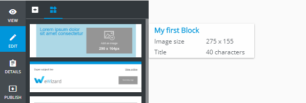
Block metadata
eWizard editor takes out the information about the blocks from the file blocks.json in root of blocks-library directory and add all the blocks denoted in blocks.json to sidebar.
Also, blocks.json contains meta information with block content description. That information is showed in when user hover the mouse upon a block in sidebar.
Each block from the blocks-library should be described as an object in components array of blocks.json file with the following structure:
json
"components": [
  {
    "id": "my-block", //the block component name from blocks-library/[block-name]/index.vue file
    "name": "My first Block", //stands for the block name in eWizard sidebar
    "model": {},
    "icon": "common/blocks-library/my-block/icon.png", // path to the block icon which will be displayed in sidebar
    "metadata": [ // the metadata to be displayed in tooltip
      {
        "id": "image_size",
        "label": "Image size",
        "value": "275 x 155"
      },
      {
        "id": "title",
        "label": "Title",
        "value": "40 characters"
      },
    ]
  }
]
Each object in metadata is rendered as a new string with helpful information, that appears when the user moves the mouse pointer over a block in the sidebar. That information may help the user to understand which type of content block has and to find out the content description and properties.
As a result, the following sidebar tooltip of my-block may appear:
Adding block to ET
If you are going to add any block from the block library to ET markup, just copy directory with a block to the common/blocks/ directory.
Then add the tag which corresponds block component name to ET markup:
html
<template>
  <div align="center">
    <wiz-layout class="content-wrapper" style="border-spacing: 0; background: #ffffff; table-layout: auto" align="center">
      <my-block></my-block>
    </wiz-layout>
  </div>
</template>

<script>

export default {
	name: 'v-app',
	components: {},
	data() {
		return {
		}
	}
}
</script>

<style>
	@import "common/styles/main.css";
</style>
To check the results run wiz dev command in the root of ET directory and open ./index.html file in any browser.
Adding block in eWizard editor
To add the new blocks to email, switch left sidebar to the Blocks tab and drag the block to the required position in email.
eWizard editor automatically adds the block from block-library to common/blocks/ directory with a new name. Any changes applied to the block content are stored in common/blocks/[block-name]/index.vue file of the email.